Bill Mayer
Treasure Hunters of The Financial Crisis; New York Times
NOVEMBER 22, 2013

Minh called me Monday with another little rush job. I am guessing because all of you were partying at AI . Oh, wish I hadn't procastinated, that is always such a good party and great seeing all of our friends in New York. But lucky for me you are all busy so I get to do another piece for the Times. Minh joked "we'll have to start calling it the Bill Mayer Times."
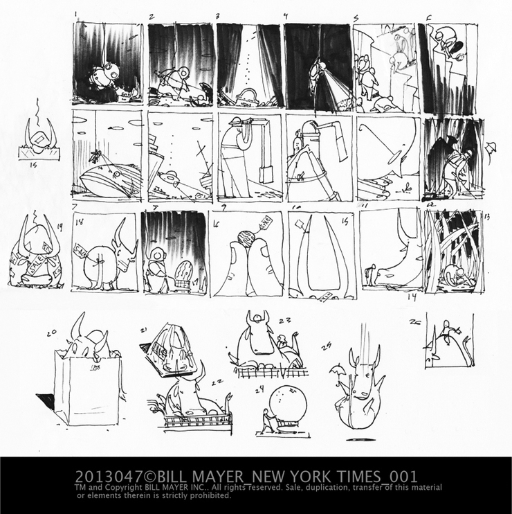
Most of the time, my first idea is the strongest, but I always feel it's important to give art directors alternative ideas. Just in case I stumble on to something better. Sometimes it's just fun exploring. Minh gets back to me, he wants to know if we can add the element of having fear. The other investors running away, maybe a long vertical with a storm, and boats fleeing the area. I am totally puzzled on how to make this come off. I thought of having the little boats on the suface might get the idea across without it getting too complicated. I did a few more thumbnails and sent them off.
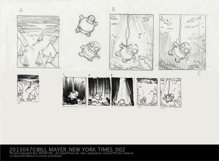
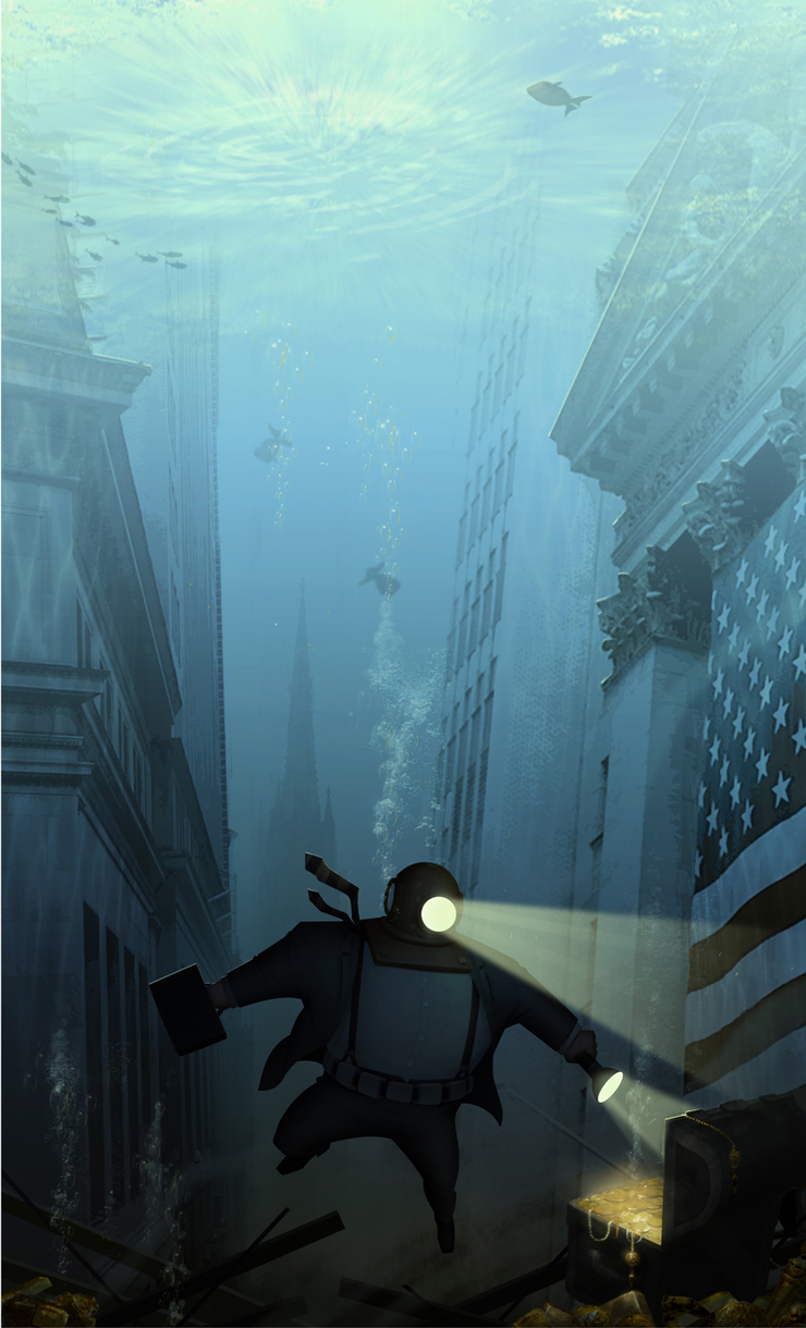
The addition of the buildings rather than ships on the bottom really made the concept work a lot better so I decided to keep them in; seemed to make more sense. Minh liked this idea but wanted to change the buildings to "Wall Street." I liked the idea of the narrow, cavern-like streets of lower New York.
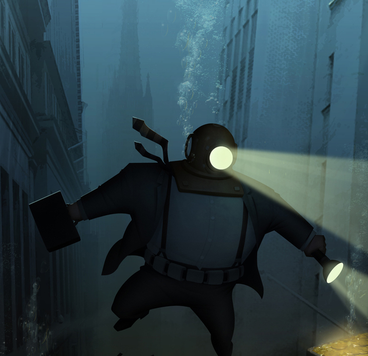
Minh sold the idea. They made one more request; he asked if i thought it would work to put the guy in a suit, He said we could get rid of all of the other elements, if I could put him in a suit. He thought it was a good trade-off. My original dive bell comp was round so my first sketch of the guy was big and round. Mihn thought it seemed like we were making fun of the guy, wanted it to be less humorous. My second take on the guy was still bulky, but now more "Super Hero Like." This really was a collaboration with Minh. He is a really smart art director, and I think his suggestions made this piece work that much better.
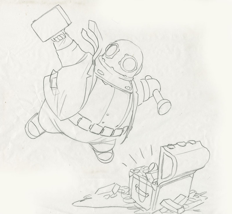
Ny first sketch of the fat bulbous diver in a suit... Okay I get it...looks like "Wimpy" scuba diving....And the treasure chest.
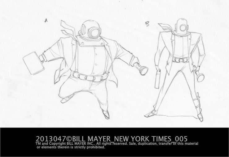
the two revised options "super Hero" like guy . We all like the a version.
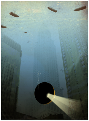
The final piece turned out pretty cool, I sent off a screen capture to run it by Minh. He suggests lightening it up a bit so it won't go too dark in the paper. Pulled back on some of the darkness.
It always feels great to get a thank you note back from a client. Minh sent me a couple of notes.
"Our executive editor... She thought your art for SundayBiz was "conceptually smart".
Thanks Bill, for making me look "smart".
Actually Minh, I should thank you for making me look so smart . You are a genius. Thanks again to Minh Uong and The folks at the Times.
© 2024 Bill Mayer