Bill Mayer
Oz-Cetera
AUGUST 17, 2011
Oz-cetera Creative Directory © Bill Mayer 2011
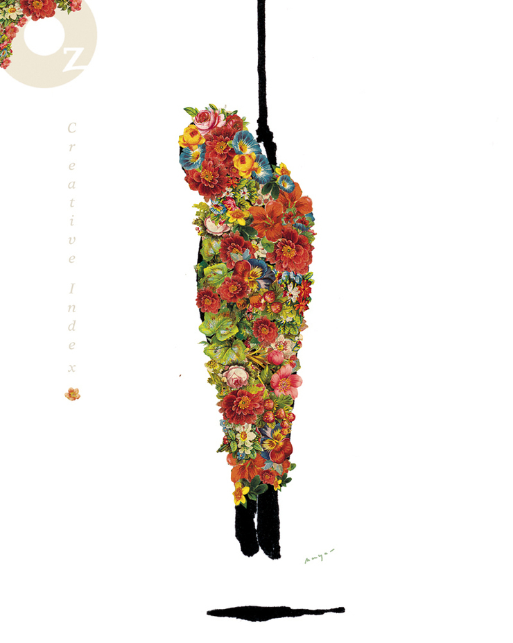
This drawing started off as an idea to take something disturbing and try to cover it up with something beautiful. Sort of a masking of the harsh reality of death but also became a symbol of resurrection as well. I thought this might make for a little series of its own. taking evil or disturbing images and covering them with flowers.

The art director a Oz asked me for some ideas on how to handle the type on the cover .One obvious direction seemed to be to play down the logo and title of the book so there would be a sharp contrast with the color on the image. I played around with adding some of the old collage flowers into the logo and title.Subtle seemed like a better approach.
© 2024 Bill Mayer