Cryin' in my Beer
MARCH 29, 2007
I was given a lot of creative leeway and the results were something we could be proud of.
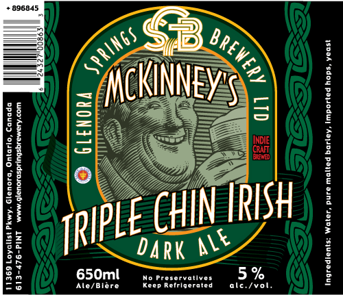
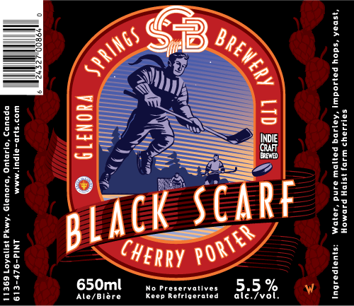
Designing a good beer label can be a bit of a challenge. I wanted these to have a traditional look, but also wanted the illustrations to be featured prominently. Each label has a predominant color so that you can quickly identity which ale or lager you are about to enjoy. In the province of Ontario there is a government body, the LCBO, which distributes alcohol to the citizens. There is a list as long as your arm of what you cannot put on a beer label. The hockey player at the bottom was nixed eventually. Can't have people participating in sports associated with beer! I had a design of a tractor on one of the labels that was given the kibosh because someone decided it was a motor vehicle. We got away with the sailboat! Of course, I've never heard of a sailor having one too many, have you? There is logic in there somewhere.
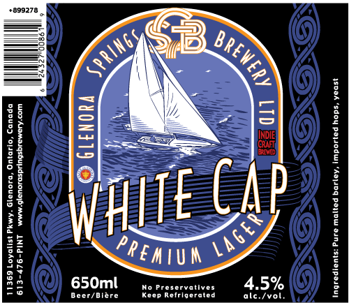
Oh well.. I didn't want to let this go without acknowledgement, so here are the labels we created. It was good while it lasted!

© 2024 Carl Wiens