Isn't that horse dead already?
FEBRUARY 12, 2015
Continuing my obsession with banknote/currency style and thanks to delightful clients (and that means you, Gregg Runberg) who humor me and enable the madness, I just knocked off yet another cover and addition to my by the numbers (or, should that be buy the numbers) gallery.
OK, seriously, every assignment has a message and how better to express it than steep it in imagery which is memorable and familiar.
What follows is a tedious, and yet, cursory description of the process.
OK, seriously, every assignment has a message and how better to express it than steep it in imagery which is memorable and familiar.
What follows is a tedious, and yet, cursory description of the process.

Although there was an early suggestion of "bright colors," a pretty much standard request for nearly every job I do, cooler heads prevailed and drew us to subtle and understated hues. Find the signature and feel confident that you are not too proud to amuse yourself with pointless trivia. Oh yeah, and that thing on the lower left is my way of fighting back against them always plastering an unsightly address label right on top of my precious artwork.
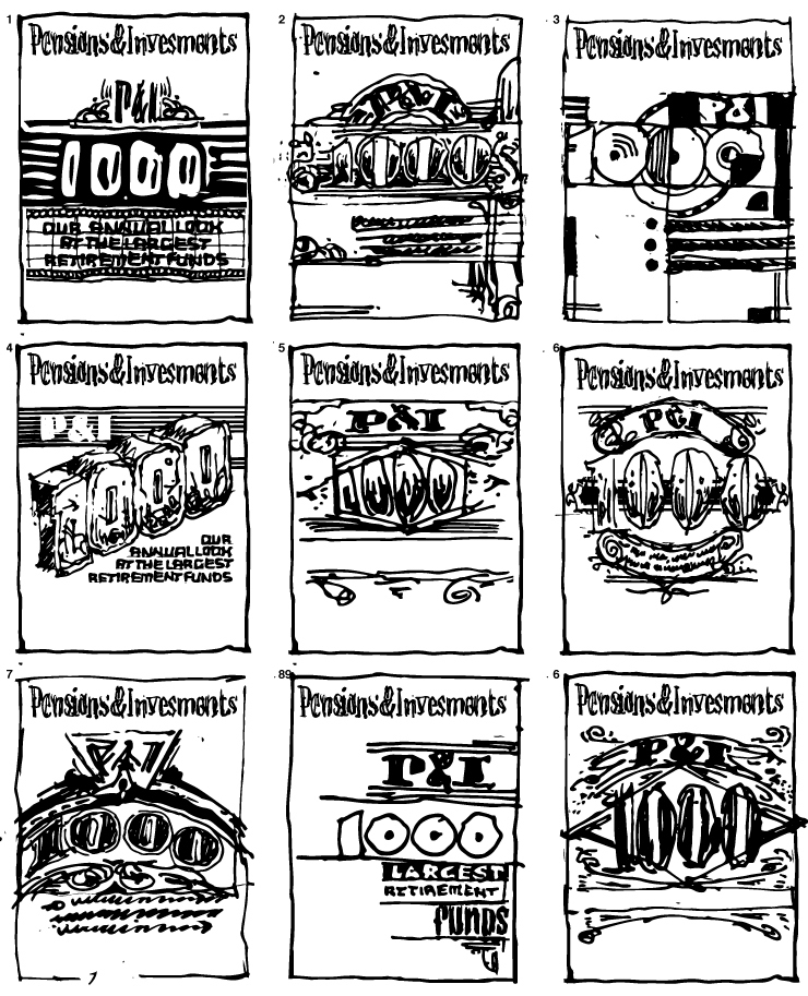
My usual sketch process of way too many indecipherable scribbles resulted in this art director's nightmare.
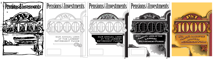
With the publisher and editor biting their fingernails, I began the process of making good my bet on this one, all the while being certain that I would crash and burn but, miraculously pulling out of a dive in the final moments.
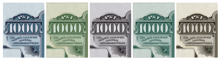
"I’m not sure the color palette works for us. I was envisioning a little more contrast – maybe the background needs to be lighter? I’m not liking the purple tones either. I loved the earlier outline with the black. And what do you think about a more green palette?" prompted a variety of alternate visions.
© 2024 Daniel Pelavin