 Weight Trainer Johnny Parker for The American Scholar
February 26
Weight Trainer Johnny Parker for The American Scholar
February 26
 2023 Wealth Management Cover
December 24
2023 Wealth Management Cover
December 24
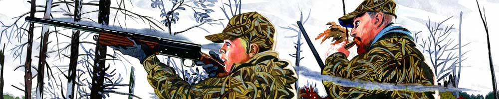
 The Waking Wounded
December 24
The Waking Wounded
December 24
 New York Magazine - Rupert Murdoch
October 12
New York Magazine - Rupert Murdoch
October 12
 Rupert Murdoch and Tucker Carlson for New York Magazine
October 12
Rupert Murdoch and Tucker Carlson for New York Magazine
October 12
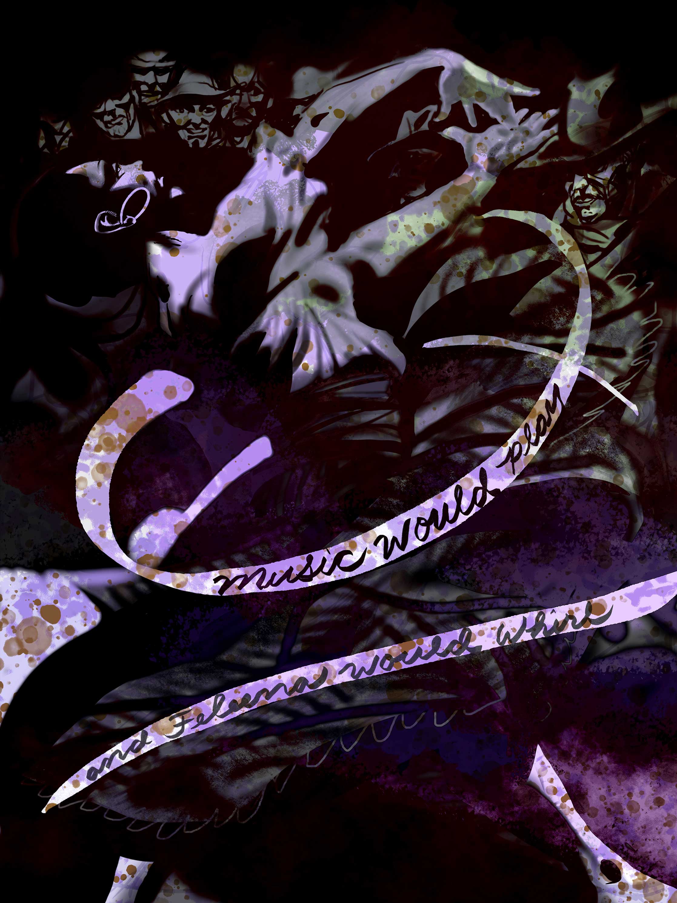 El Paso; #4 "Music Would Play and Felena Would Whirl"
October 12
El Paso; #4 "Music Would Play and Felena Would Whirl"
October 12
 Ron Desantis for New York Magazine
October 12
Ron Desantis for New York Magazine
October 12
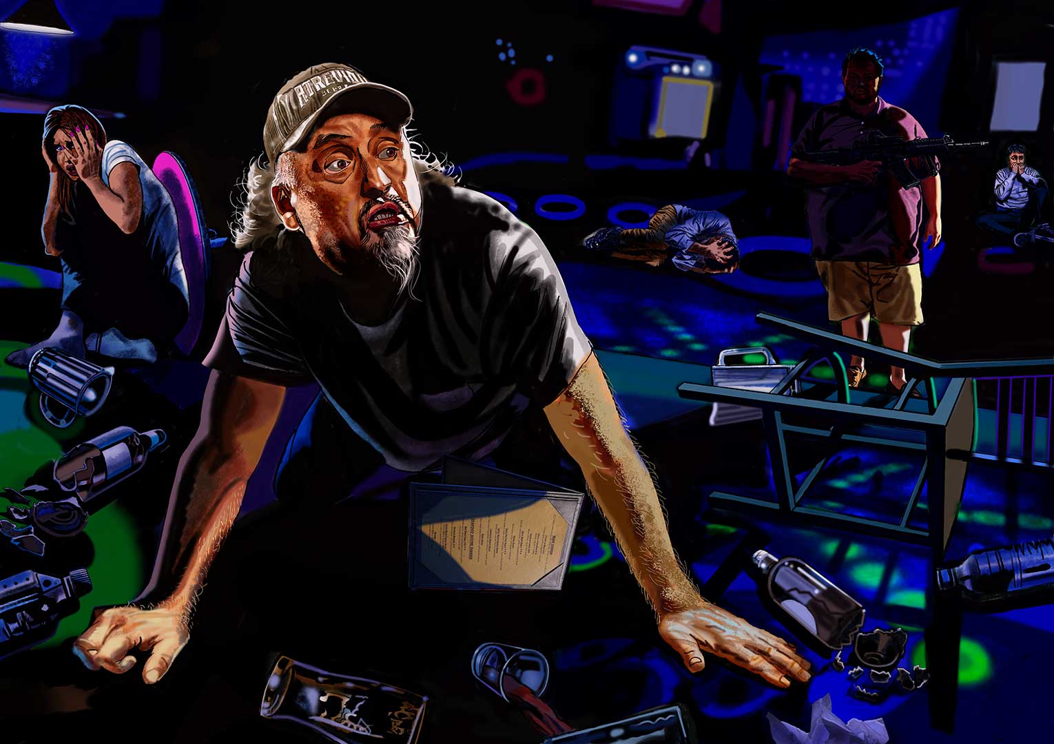 Club Q Mass Shooting for Reader's Digest
October 12
Club Q Mass Shooting for Reader's Digest
October 12
 2023 Baseball Hall of Fame, Memories and Dreams Cover; Inductees Scott Rolen & Fred McGrif
August 3
2023 Baseball Hall of Fame, Memories and Dreams Cover; Inductees Scott Rolen & Fred McGrif
August 3
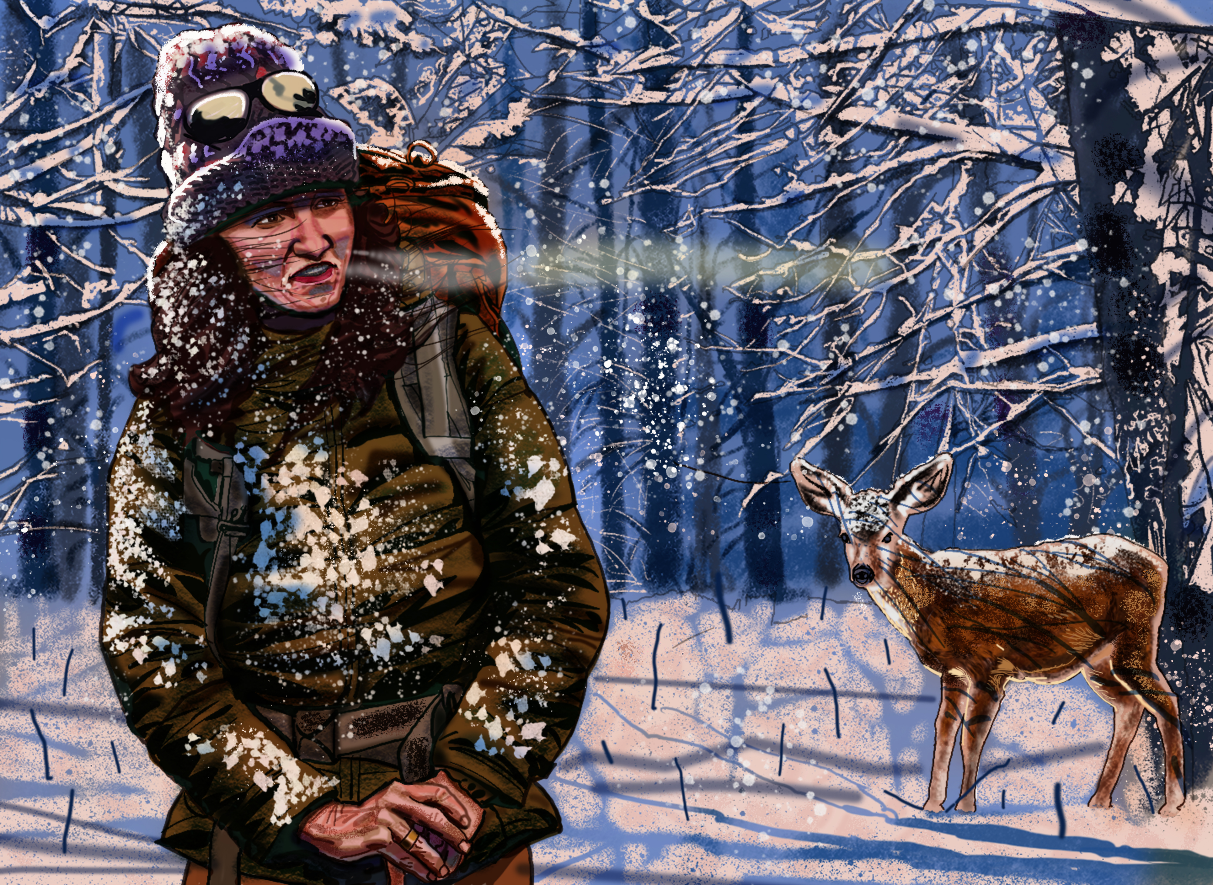
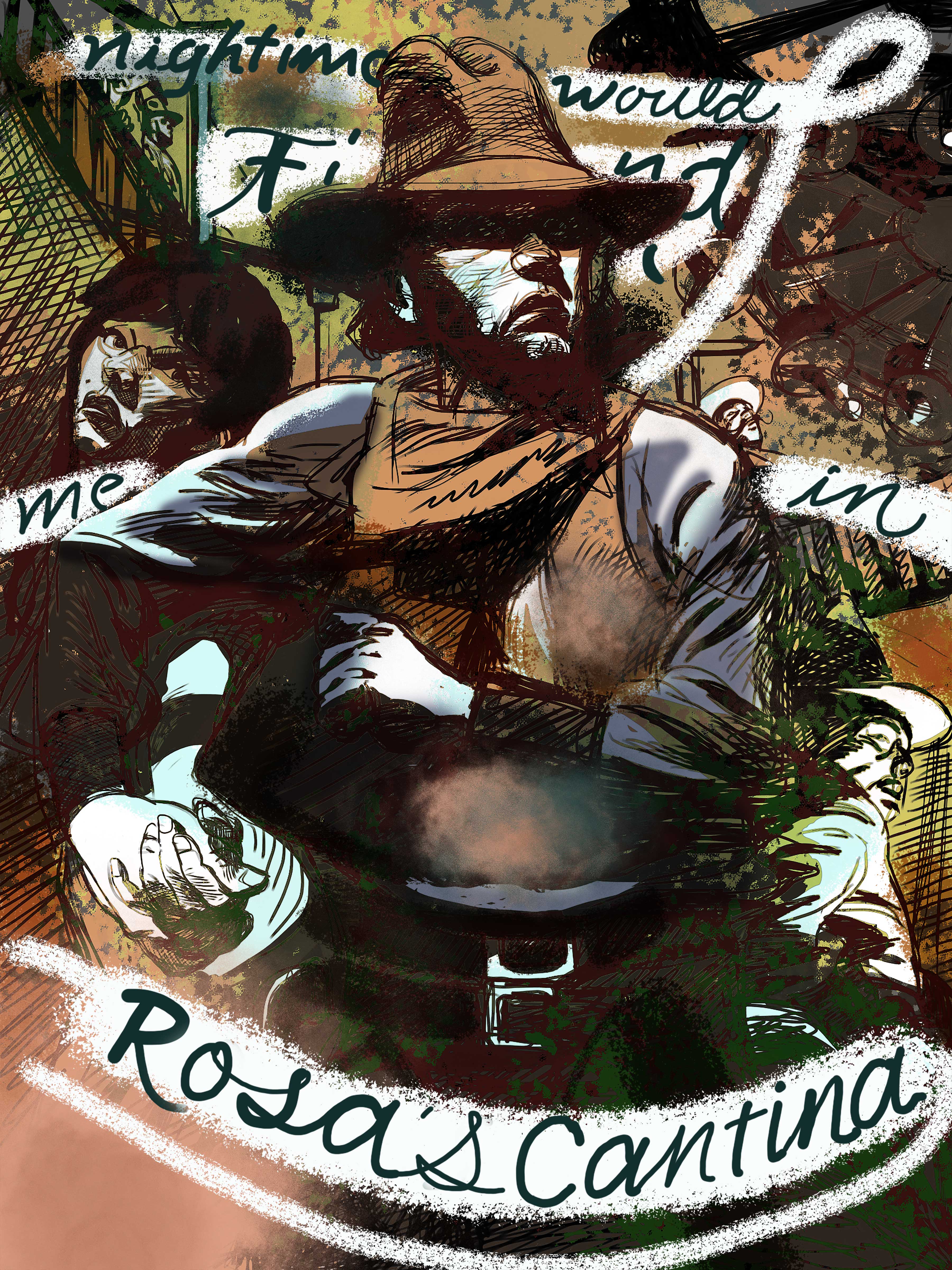 El Paso by Marty Robbins, "Night would find me in Rosa's Cantina"
June 17
El Paso by Marty Robbins, "Night would find me in Rosa's Cantina"
June 17
© 2024 Jeffrey Smith