Drawing in the Real World
I got a call from Martin Colyer at Reader’s Digest London in September 09. Martin had a friend named John O’Reilly who was creating a magazine for illustrators titled, ”Varoom.” They asked me to write an article for the Winter 2009 issue. The article would be about my work, and would appear in a section of the magazine called Notes on Drawing. I happily accepted their invitation.
The folks at Varoom, and AOI are big fans of Drawger, and they’d love for you to check them out.
http://www.theaoi.com/index.php?option=com_frontpage&Itemid=41
Varoom tracks the very latest in the world of illustration, discovering the new styles, exploring the world of illustrators and the people who commission them; digging deep into the big social, political and cultural ideas expressed in current illustration, showing the most exciting, provocative, moment-defining work, and revealing the creative and human stories behind it.
Varoom Magazine.
Drawing In The Real World by Jeffrey Smith.
There is an important connection (in my work) between figure drawing and narrative illustration. The connection is empathy, and storytelling. The first order of business in drawing the figure is empathy. When I teach my students to draw, I ask them to try to understand the model, much like a story. What is the pose expressing, and what is peculiar about the model? I refer to the art model by name. And I try to point out that when Jennifer poses, she brings an entirely different idiosyncratic expression than say, Sarah. Both women have the same anatomy, and both tell a different story.
My experience with students is that they need to feel risk in order to see clearly. To that end, I ask them to begin the drawing, not where they are comfortable, but rather, where it means the most. I ask them to begin with the center of gravity in the pose. Very often, this tends to be in the middle of the figure, not the head.
From that beginning, I encourage them to find the lines that best describe the gesture of the pose as they move up towards the head, and down towards the feet. I ask them to draw each line with energy, and commitment, and to be descriptive. In other words, draw those first lines as finished lines, but with sufficient speed so as to feel the gesture in the body. Draw every line with a sense of risk. I want them to grow the drawing with rhythm. That process of deliberate commitment and thought provoking risk is exactly how I like to make an illustration.
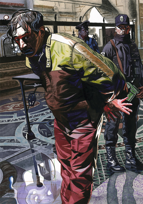
The Security Management illustration is about true crime. In my universe, this is called a re-creation illustration. The story was based on a rash of bank robberies that occurred in Mexico. The editors wanted to talk about the many ways that security technology effectively fights crime. I’m not very interested in security technology. Bank robbers on the other hand, are a different story.
To re-enact a story, you must understand the essence of it. The key words for this article are security, and crime. The symbols I chose were criminals and cops. As it happens, I am of Mexican decent. And whether by nurturing, or by nature, crime is something I have empathy for.
For reference, I used myself as the model for the Mexican bank robber. I placed a spot light straight over my head, and cascaded my hair forward to emphasize wildness. I thought of Di Nero in Cape Fear. Setting the camera on a tripod, I used the self-timer button to take pictures of me in the pose. I thought of the guy on the ground in the North Hollywood bank shoot-out as he lay dying. Danger in his eyes; fatigue in his bones. I went to Google images to find the interior of a bank. It took me the better part of 2 hours, but I finally found a bank interior that “felt” good. I found some reference on Mexican police and I was good to go.
To tell a visual story clearly, you must create order. Primarily, this is a picture that uses foreground, middle ground and background. Abstractly, I used triangular composition, and my primary idea was to arrange the heads of the criminal and the cop, and the hands of the criminal, into a triangle. But many secondary triangles began to appear once I started using rectilinear drawing in the lower part of the criminal’s legs. And then I began to see why the bank reference was so interesting.
It was loaded with circles, triangles, and reflections. Pattern is a beautiful thing! I trapped the lights in the foreground and used atmospheric perspective in the background. But perhaps the most compelling thing in the image is the danger in his eyes and the fatigue in his body, the figure drawing.
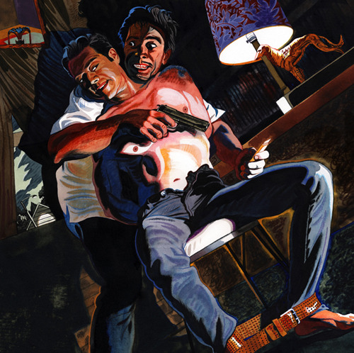
The Playboy illustration was for a story titled, “Nobody Move” by Denis Johnson. It is a fiction story written in a Noir style. This illustration is based on a narrative moment when Juarez catches Jimmy Luntz. He wants his money! And he’s going to torture Jimmy until he gets it. So the words I focused on were sadistic and torture.
Growing up in a small, two-bed room house as the youngest of 6 children, I have some empathy for that!
Knowing I wanted to shoot reference, I started to think about hiring models.
Earlier in the story, one of the characters describes Jimmy’s body as slightly feminine, so I hired a female art model to pose as Jimmy Luntz. I was very excited about this. I thought transformation might give the illustration just the kind of weirdness it needed.
I used myself as Juarez because I needed 2 figures in the shot. Juarez’ face was already fermenting in my imagination, and I have Francisco Goya’s wild-eyed, insane demons to thank for that. I sat the art model in the chair, naked from the waist up. I tied her hands behind her back, and buckled a belt around her feet (who says illustration isn’t any fun?) I posed as Juarez and thought of the great Spencer Tracy in the 1941 classic, Dr. Jekyll and Mr. Hyde; the way he drives Ingrid Bergman insane. I found the dog lamp, the chair, and the exterior, gable end of the house on-line. With all of my reference composed in Photoshop, I tilted the frame and subtly arranged arms, legs, and shadows into a triangular composition. I used interior-exterior for scale change, and color contrast. Lastly, I designed the light shapes to create movement, balance, and abstract design within the composition.
The differences between fiction (Noir) and true-crime (re-creation) illustration can be substantial or nothing at all. Fiction is supposed to be a literary work based on imaginary people and events, but not always. The editor of a magazine might not want the characters in the story clearly portrayed, but then again he might. A fiction assignment is probably not going to revolve around a likeness. And I will probably feel more inclined to use a degree of transformation and distortion. In fiction, the illustration often feels like a very real dream.
True crime, or re-creation assignments are about real people and real events. It usually means that you have to paint a likeness of a recognizable person in a specific situation (though not in the example I’ve offered here.) The illustration might pivot on the available photographs of the main subject in the story. When I visualize a narrative image, it is with that reference in mind. And in the end, it has to feel real.
In any case, figure drawing, fiction illustration or true crime illustration is about telling a story with empathy. An illustrator must recognize the story in whatever he is looking at, be it real or imagined. But the truth is that I have a tough time knowing the difference between what is real, and what is a dream. I suspect, in art, there really isn’t any difference at all.
What follows is my article, and the images that accompanied it.