 Dante's Inferno
December 18
"Midway upon the journey of our life
I found myself within a forest dark,
For the straightforward...
Dante's Inferno
December 18
"Midway upon the journey of our life
I found myself within a forest dark,
For the straightforward...
 AI-AP PROFILES Interview
October 23
I'm honored to have been interviewed by the talented Robert Newman for AI-AP's PROFILE Series. You can check...
AI-AP PROFILES Interview
October 23
I'm honored to have been interviewed by the talented Robert Newman for AI-AP's PROFILE Series. You can check...
 Neil Young: The Monsanto Years
June 29
There are certain artists who remain true to their vision throughout a career, who explore and grow without...
Neil Young: The Monsanto Years
June 29
There are certain artists who remain true to their vision throughout a career, who explore and grow without...
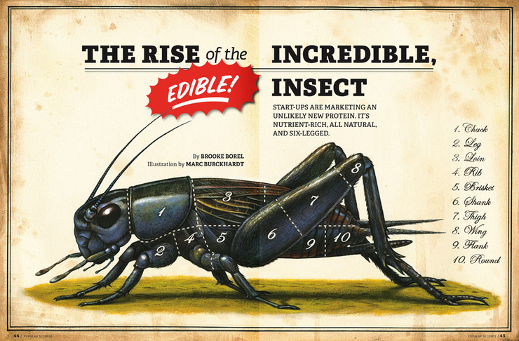 Mmm, Crickets
April 3
A few weeks ago, I received an email from Zach Gilyard at Popular Science about a project that I jumped at the...
Mmm, Crickets
April 3
A few weeks ago, I received an email from Zach Gilyard at Popular Science about a project that I jumped at the...
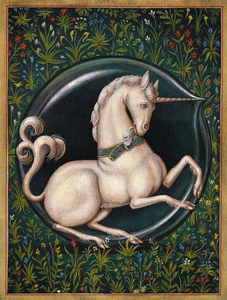 The Age of the Unicorn
January 29
The unicorn has existed—if only in the imagination—through most of written history and in almost every...
The Age of the Unicorn
January 29
The unicorn has existed—if only in the imagination—through most of written history and in almost every...
 Je Suis Charlie
January 9
http://www.charliehebdo.fr
Je Suis Charlie
January 9
http://www.charliehebdo.fr
 NYT Book Review Cover
March 1
I was recently contacted by Rex Bonomelli at the New York Times Book Review to create cover art to accompany an...
NYT Book Review Cover
March 1
I was recently contacted by Rex Bonomelli at the New York Times Book Review to create cover art to accompany an...
 Horse Power
February 3
Just before Christmas, I was contacted by Fred & Farid's office in Shanghai regarding a commission for...
Horse Power
February 3
Just before Christmas, I was contacted by Fred & Farid's office in Shanghai regarding a commission for...
 Courage (Liquid and Otherwise)
January 3
It's been a little while since I've posted, but I thought the beginning of the new year—and the gala...
Courage (Liquid and Otherwise)
January 3
It's been a little while since I've posted, but I thought the beginning of the new year—and the gala...
 LA Shows: BLAB! and La Luz
September 6
I have some new pieces in two exhibitions in Los Angeles over the next week: BLAB!, the 9th Annual exhibit and book...
LA Shows: BLAB! and La Luz
September 6
I have some new pieces in two exhibitions in Los Angeles over the next week: BLAB!, the 9th Annual exhibit and book...
© 2024 Marc Burckhardt