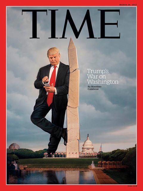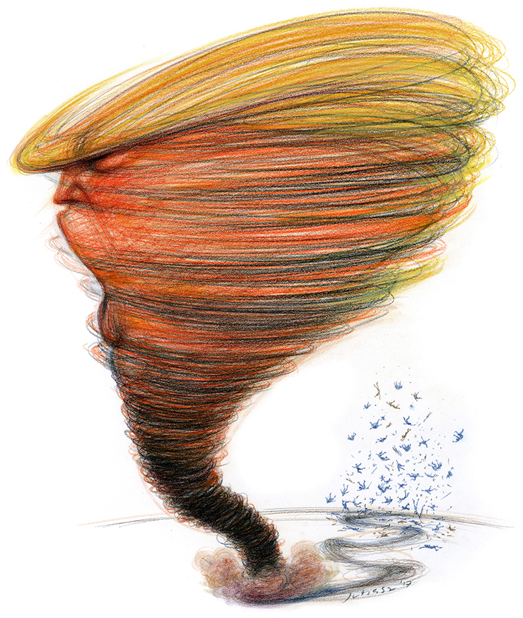
The Bigly Rolling Stone Cover
The last time I did a cover for Rolling Stone (which also happened to be the first time) was towards the end of 2008, after the November elections that saw the end of the dismal George W. Bush years and the beginning of Barack Obama’s confrontation with D.C. reality. The headline of that issue, in retrospect, remains a lesson never to make definitive pronouncements no matter how much the current circumstances seem to confirm it. The GOP was not destroyed. Instead the one time party of Lincoln metastasized into an even more virulent party of culture and race rage, victimhood and vengeance. Even so the illustration was one of my best and most exaggerated Bush caricatures and a very noteworthy career milestone. I could actually say I was on the cover of a Rolling Stone.
Fast forward eight long, bitter years of corrosive partisan hostility and we have another president in the White House. A new kind of president; a reality TV star fiction made flesh; a creation perfectly suited for a modern American ADD challenged audience conditioned to a pop TV celebrity obsessed culture of low, feeling driven opining over facts, endless verbal and physical smack downs, back stabbing, crude simplistic thinking, outrage, drama, endless drama, hysterics and invective. It’s been generations in the making and should have come as no surprise. Since the election and even more so since the inauguration the nation has been held captive to a daily maelstrom of high drama mostly conducted on a 5th grader’s maturity level. Chaos is the new norm for conducting the affairs of state and lots of distracting theatrics the method to keep John and Jane Q. Public from noticing the actual important activity going on in Congress and the Oval Office. Tweets as smoke bombs.
Speaking for myself, it’s been a rare experience working with the art and editorial departments at Rolling Stone to have more than a week, from start to finish, to create images for their pages, and quite unprecedented to be contacted nearly a month and a half before estimated publication for a potential cover assignment. When Joe Hutchinson first touched base in early February the only thing certain was that it would be about Trump. The magazine’s brilliant Matt Taibbi didn’t even have an outline. How could anyone even begin an outline? From the very start of this chaotic presidency the plotlines, melodramas and cast of characters were shifting on a daily, sometimes hourly, basis. Every morning seemed like another firestorm swirling around unhinged tweets issued in the middle of the night from executive chambers. It would make for a riveting, entertaining Netflix series except it was all for real and in many respects not fun. All one could do under the circumstances was to follow as best as possible the upheavals and start jotting ideas and forward them in emails. By the end of the second week it was becoming apparent to me that I was running around in circles trying to keep pace with the news, that any attempt to address one particular topic usually wound up getting upended by the next morning’s headlines. Matt couldn’t even start filing raw copy until March 3rd. By the end of February we had a very rough outline from him about what he planned to focus on.
When I first started out as an illustrator it was very common, especially with publications like the New York Times, to meet with the art director, sit down and kick around ideas in the office. That method of working had pretty well disappeared by the mid to late eighties. The convenience of the fax machine, yes that ancient piece of hardware, eroded the experience of in person collaboration. It’s happened a few times over the past decade with RS that the old school approach has come in handy with tricky subjects. Sitting by yourself in the studio trying to square circles can potentially lead to unproductive circular thinking, oft times repeating a variation of an unsuccessful solution. You become trapped in your own sand pit of conceptualizing, and feel reluctant to be emailing 25 times a day new thoughts. There’s a particular effectiveness bouncing ideas back and forth in a face to face meeting. Qualifications can be raised immediately and directions rerouted. One notion shot down can trigger a quantum leap to another more successful idea. For that reason I offered to stop in the offices and brainstorm in person.
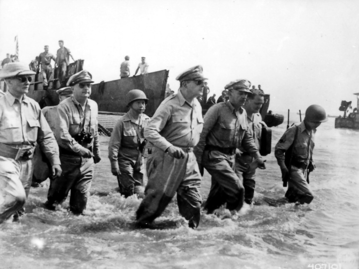
Inside illustrations for publications have the leeway to get complex and maybe even meandering provided there is some payoff in the overall image. Covers are a different challenge. Covers need to be clean, concise and attention grabbing. In this case ‘simple’ is not a pejorative as in simple minded. Instead, simple just means better. Solid. Wham. Jump off the newsstands. Pay attention. My meeting with Joe and art director Mark Maltais went on for hours. We considered concept directions sent from editors, Jason Fine and Sean Woods, as well as publisher, Jann Wenner. I scribbled in the conference room while we debated the merits of each approach. One suggestion had been to approach it as an invasion, maybe DJT, as a crazed General MacArthur type, coming out of the muddy, mucky, ‘swamp’ leading a charge. My qualification was that using MacArthur, even if parodying the iconic image of his return to the Philippines, could be misread as making DJT a heroic character. We played with magician imagery but kept returning to the argument that magicians are masters of distraction and control of the audience. With the way the news was spiraling even as we sat in the conference room there was no way we could say he was controlling the narrative by the time the cover went to press. One other negative consideration was that magicians are essentially good-natured performers. Mischievous maybe, but not malevolent.
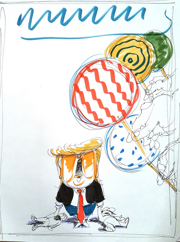
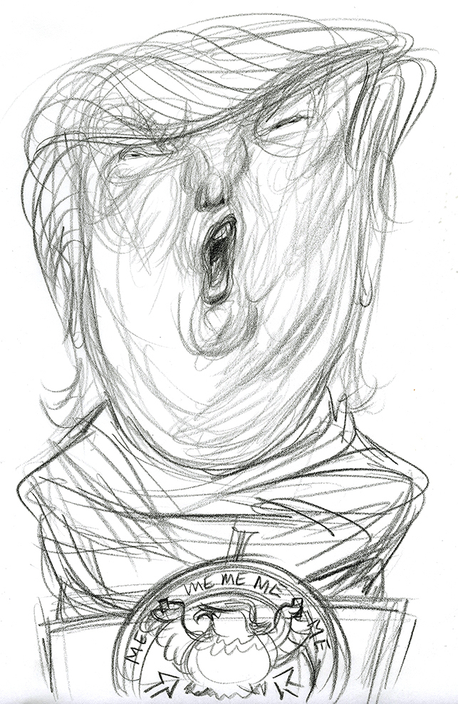
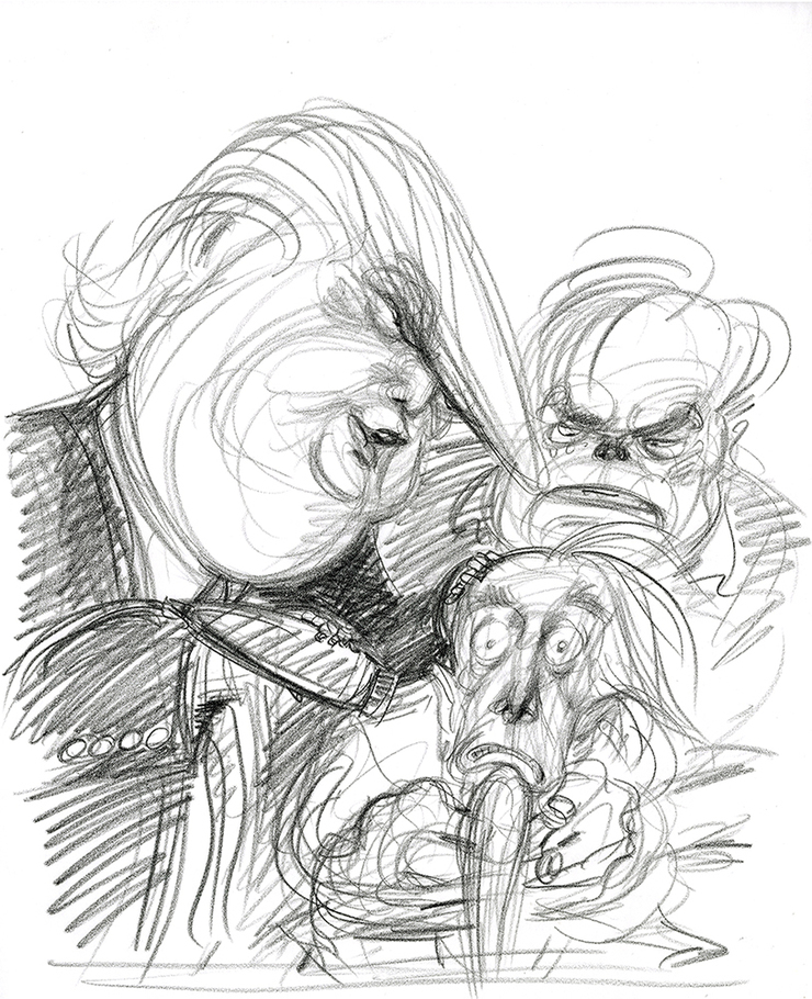
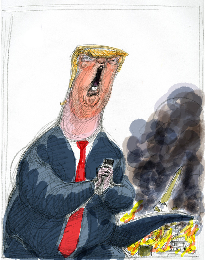
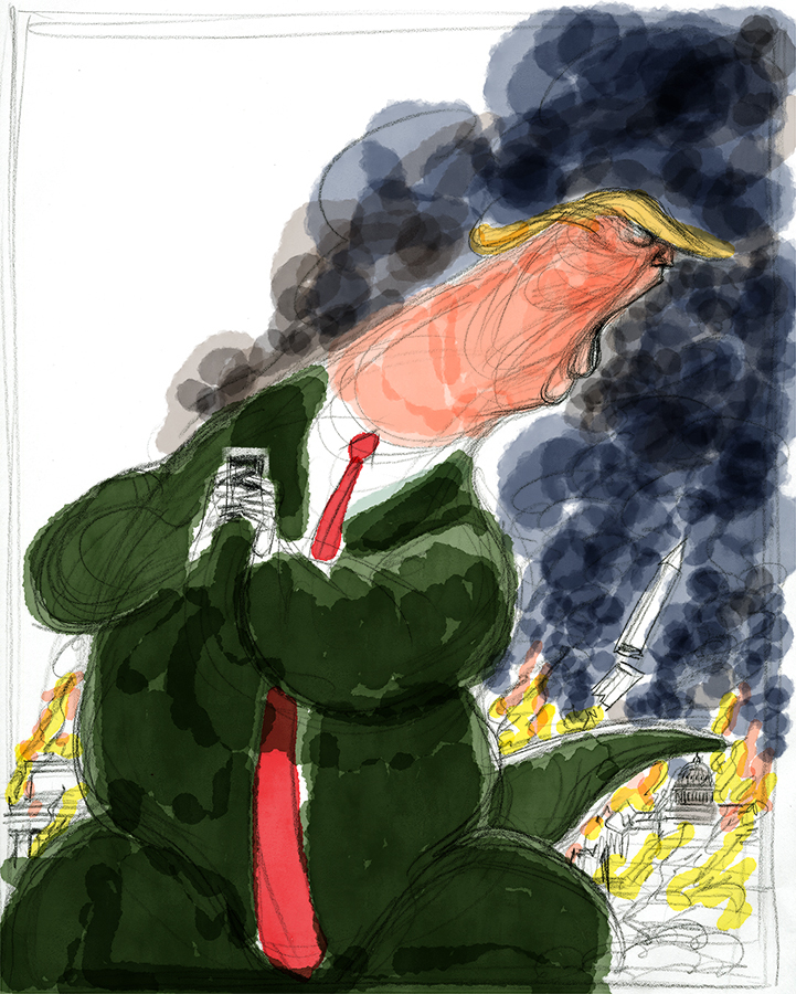
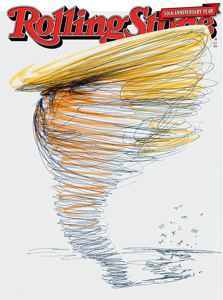
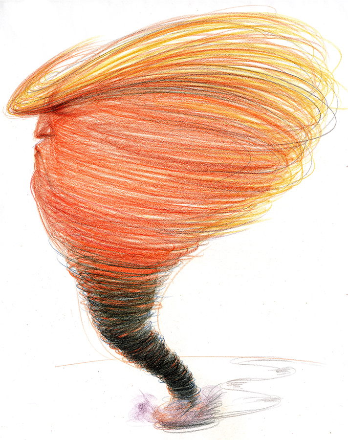
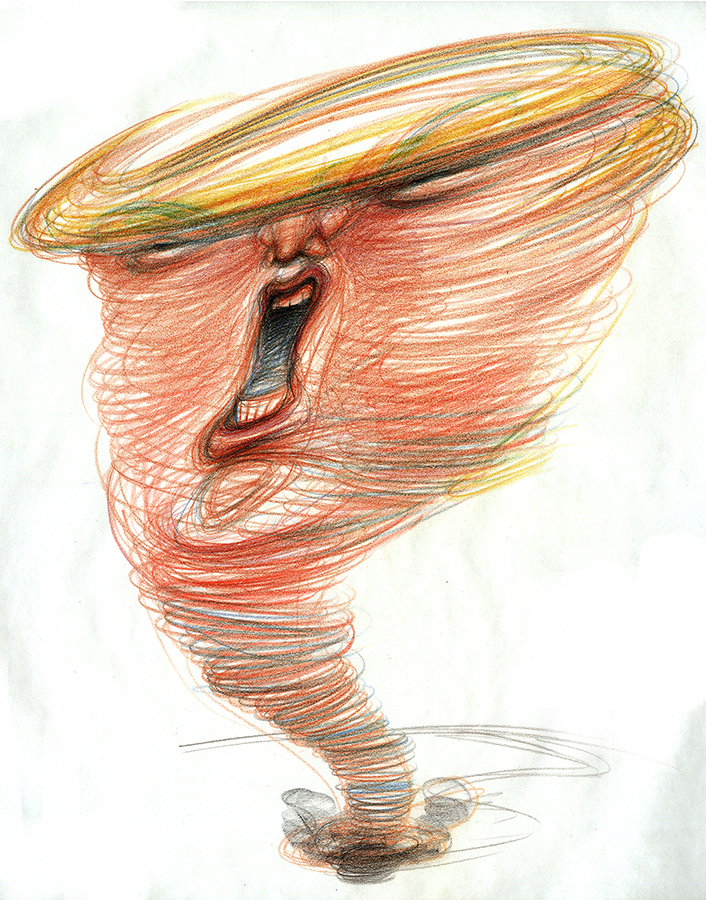
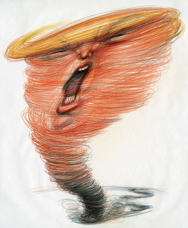
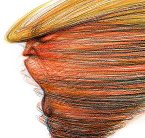
Some of my early sketches involved a number of White House characters or even making Trump a minor player in contrast to a gigantic Steve Bannon, but soon the direction was to limit the image to DJT by himself. If nothing else this approach would confirm the need for a simple themed image. A tornado sketch was quickly worked out at the table. It had been one of my earliest thoughts but I never put it to paper, my hesitation being that despite the directness of the image it had the potential danger of making DJT look powerful, especially if there was lots of Washington destruction in the background. There are many Trump supporters who might look at that as a positive since they came from the burn the house down point of view. I’m not sure whether it was Joe or Mark who considered the tornado idea out loud as an option, but it confirmed my original notion that it might have potential despite the qualifications. So it went on paper.
We felt that the brainstorming accomplished much by the time we called it quits for the day. I’d hear back regarding the responses. In the meantime the news continued to pile on. “Liar in Chief” was another cover headline to consider as the days went on. Ideas were drawn, ideas were rejected.
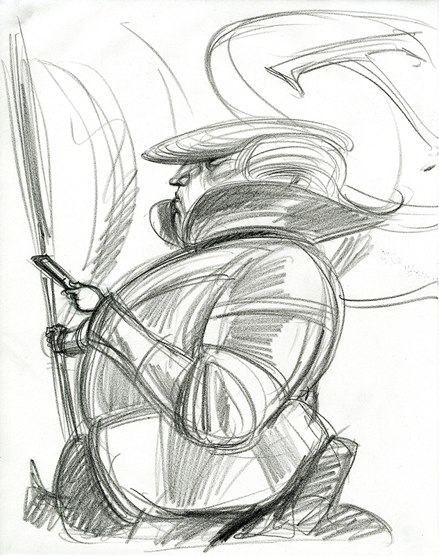
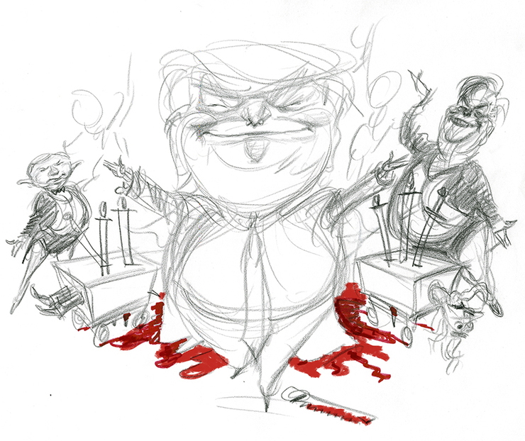
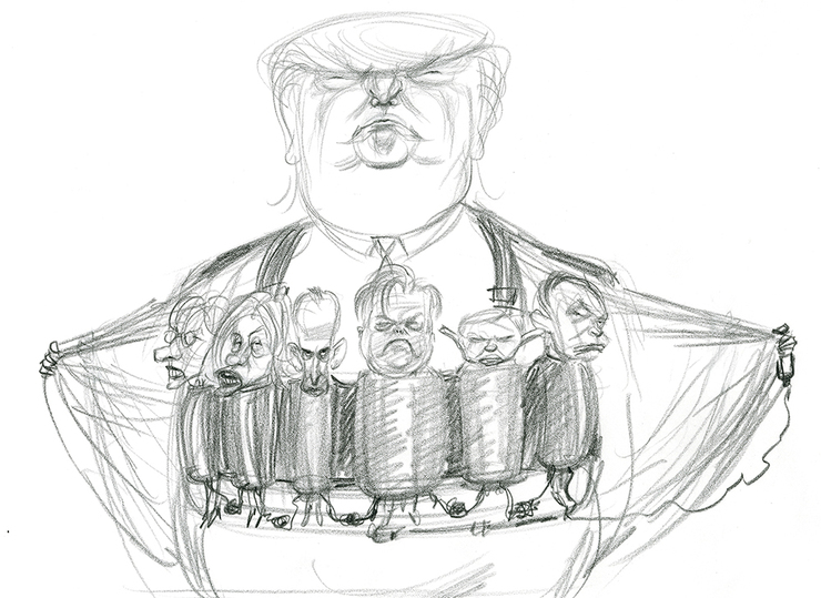
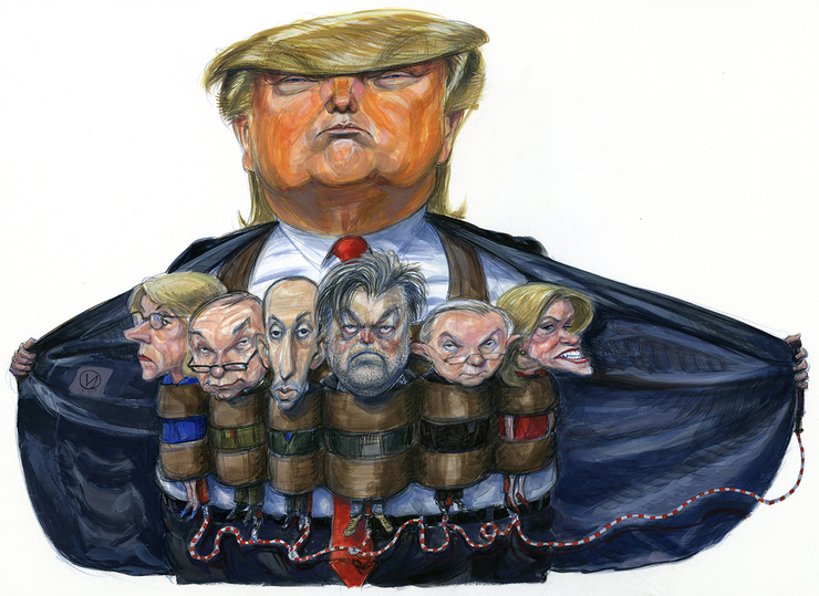
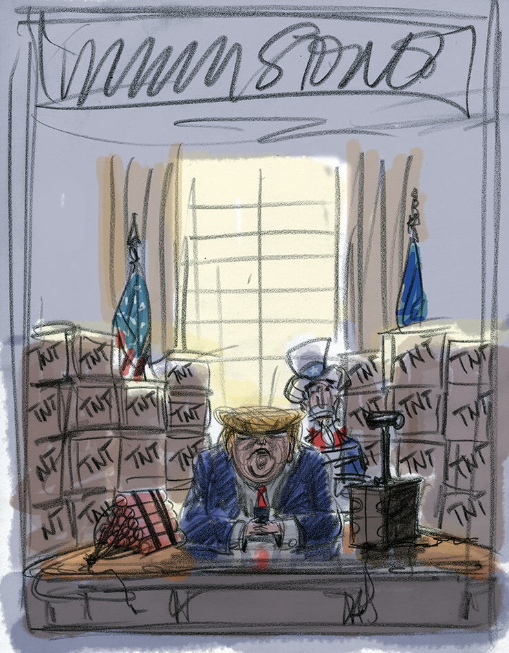
Somewhere along the line the possibility of having an illustration for the inside of the mag became a strong possibility. There was already much to choose from in terms of visuals. Some of the earliest notions that I had emailed were under consideration. Sketches that were deemed maybe too complicated for the cover had definite potential for the interior. An early favorite of mine, before falling into the pre meeting sand pit, was Trump wearing a suicide vest with some of his worst cabinet appointees and team members strapped like bombs around him. I thought it had great cover potential but Jann saw it as the perfect spread for Matt’s piece inside. Okay, one down and one cover to go.
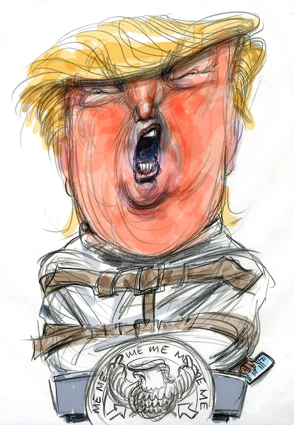
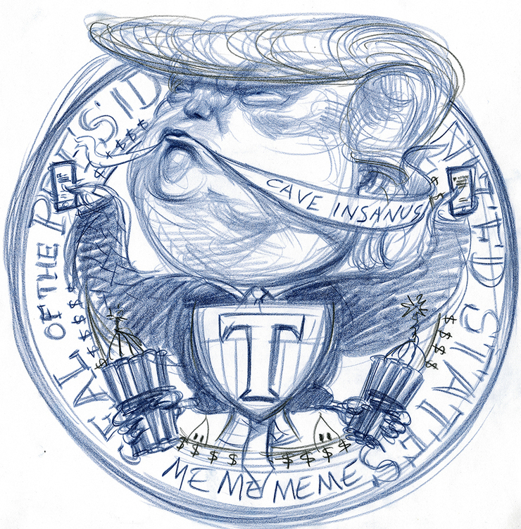
We went through a number of variations of sketches that had potential but ultimately it came down to Jann going with one of the earliest scribbles and an idea I thought of as an outlier- the tornado. I fleshed out some more options trying to morph the head into the swirls of the twister. We toyed with more details, less details. Open mouth, closed mouth.
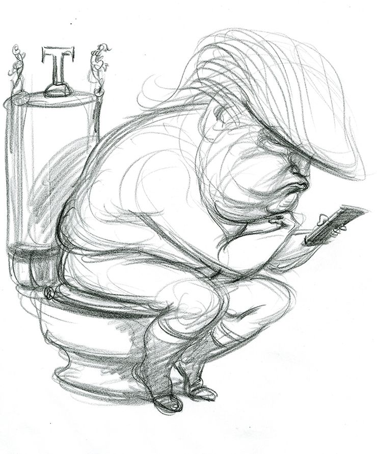
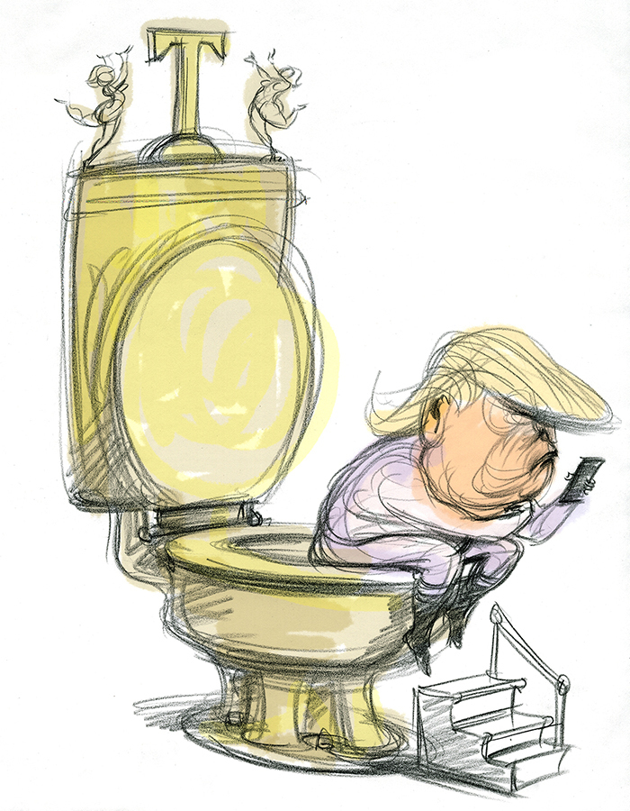
The hardest part of going to finish on the cover illustration was working loosely within a finalized space where the image would drop. Once I have parameters laid out, my instinctive response is to tighten up and control where the linework and gestures travel. In this circumstance, I had to keep the drawing lively and spontaneous in feel without getting sloppy, but also make sure that I didn’t let the liveliness mess with the headline/s that would appear on the cover as well as the area where mailing addresses would be printed (In actuality, I had all forgotten about the mailing address space.). I rejected pen and ink as the medium and went with the very dependable Prismacolor pencils, retaining an option to drop some watercolor/gouache if necessary. The colors and plasticity in the pencils were just what I needed but didn’t prevent numerous false starts before I felt something was happening. Even as this was going on there was a debate going on back at RS whether more or less of the face would work better. More swirls, less swirls? Darker lines or more orange area? Options were presented. We went with more definition and a very judicious inclusion of swirls. Considerations continued till the twelfth hour when it went to press but when it did we knew we had a winner.
Working with ROLLING STONE has been one of those relationships we illustrators dream of. All the art directors I've had the pleasure to work with have been first rate great people who have your back while offering cogent feedback when necessary. This also applies to the editors. Everyone there still "gets it" in a publishing world where control of content and a desire to print wallpaper rather than imagery that makes a statement is more the rule than the exception. It's particularly satisfying contributing visuals to the tradition of great journalism that has been a hallmark of the magazine. Many thanks to Joe Hutchinson, Mark Maltais, Jason Fine, Sean Woods, Matt Taibbi and Jann Wenner.