special projects
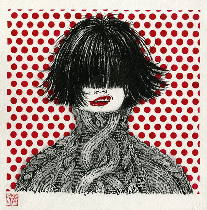
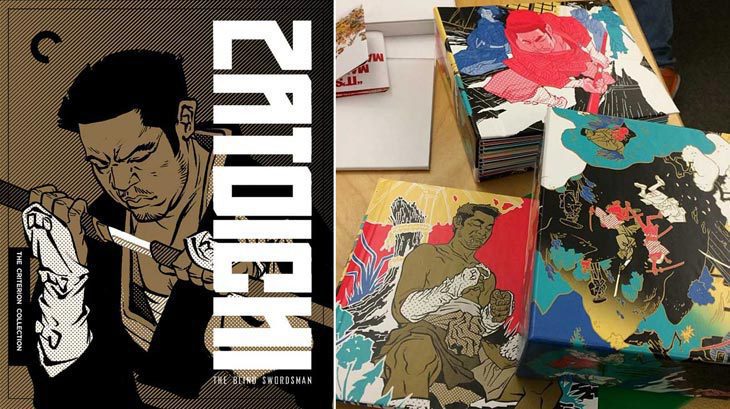 26 illustrators for Zatoichi box set
December 16
Known for their beautiful collector DVD/Blu-Ray packagings, Criterion Collection has done it again. And...
26 illustrators for Zatoichi box set
December 16
Known for their beautiful collector DVD/Blu-Ray packagings, Criterion Collection has done it again. And...
 Sketchtravel Goes to Kyoto
January 29
You may, or may not know about Sketchtravel. But, let me tell you that this is quite an amazing project...
Sketchtravel Goes to Kyoto
January 29
You may, or may not know about Sketchtravel. But, let me tell you that this is quite an amazing project...
 The Influentials
September 7
Tomorrow evening at The Visual Arts Gallery is an opening for a show The Influentials. It is a show of SVA female...
The Influentials
September 7
Tomorrow evening at The Visual Arts Gallery is an opening for a show The Influentials. It is a show of SVA female...
 a big personal work.
July 28
"how do you find time to work on your personal work?" I get asked this a lot from students.
I don't,...
a big personal work.
July 28
"how do you find time to work on your personal work?" I get asked this a lot from students.
I don't,...
 San Diego Comic-Con
July 22
I am not at Comic-Con.
Many people asked if I was going, including my DC Comics Vertigo editor Karen Berger, with...
San Diego Comic-Con
July 22
I am not at Comic-Con.
Many people asked if I was going, including my DC Comics Vertigo editor Karen Berger, with...
 buy art for a good cause.
June 2
Weather in New York is finally neither boiling hot or cold. So, come out to SOHO this Saturday afternoon, and buy...
buy art for a good cause.
June 2
Weather in New York is finally neither boiling hot or cold. So, come out to SOHO this Saturday afternoon, and buy...
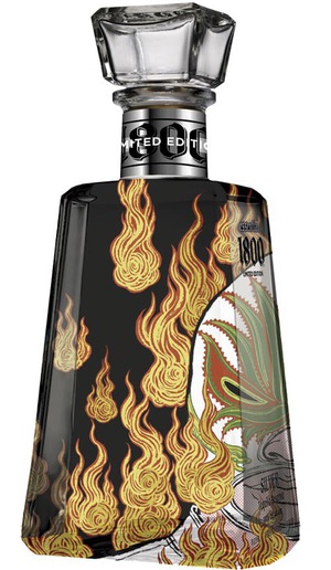 Tequila!
May 10
Many of my drawings appear on the pages of magazines and newspapers. They get read, and go into recycles in a week,...
Tequila!
May 10
Many of my drawings appear on the pages of magazines and newspapers. They get read, and go into recycles in a week,...
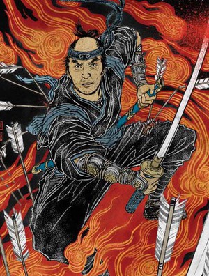 13 Assassins
April 21
Japanese people take "new year" very seriously and are superstitious about "first" anything to...
13 Assassins
April 21
Japanese people take "new year" very seriously and are superstitious about "first" anything to...
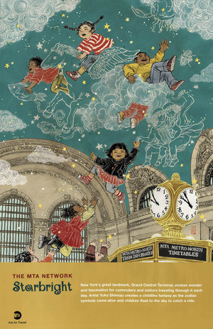 Grand Central Terminal
March 3
It will be a while till you will start seeing them at subway stations in New York, but I just got my copy of the...
Grand Central Terminal
March 3
It will be a while till you will start seeing them at subway stations in New York, but I just got my copy of the...
 vampires & diapers.
December 1
I totally judge books by their covers.
Let's be honest, we all do. I can be categorized as a book-worm, but...
vampires & diapers.
December 1
I totally judge books by their covers.
Let's be honest, we all do. I can be categorized as a book-worm, but...
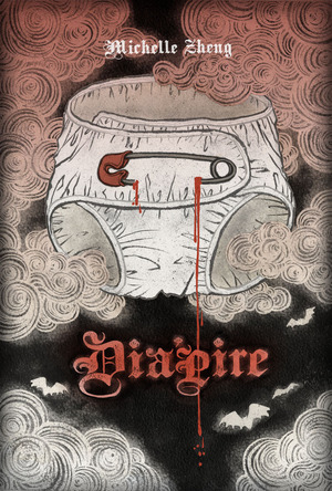
vampires & diapers.
December 1
I totally judge books by their covers.
Let's be honest, we all do. I can be categorized as a book-worm, but...
vampires & diapers.
December 1
I totally judge books by their covers.
Let's be honest, we all do. I can be categorized as a book-worm, but...
 Blow Up opens.
September 1
Blow Up, a show of works by Tomer Hanuka, Sam Weber and myself, opened today at the Society of Illustrators (NYC)....
Blow Up opens.
September 1
Blow Up, a show of works by Tomer Hanuka, Sam Weber and myself, opened today at the Society of Illustrators (NYC)....
 1/100 (belated) Head for Haiti
March 4
Many of fellow Drawgers have posted their head drawings/paintings already. My belated contribution......
1/100 (belated) Head for Haiti
March 4
Many of fellow Drawgers have posted their head drawings/paintings already. My belated contribution......
 Fun in Tokyo.
November 30
With fellow Drawgers: Gary Taxali and Thomas Fuchs, along with our friend Thilo Rothacker, four of us...
Fun in Tokyo.
November 30
With fellow Drawgers: Gary Taxali and Thomas Fuchs, along with our friend Thilo Rothacker, four of us...
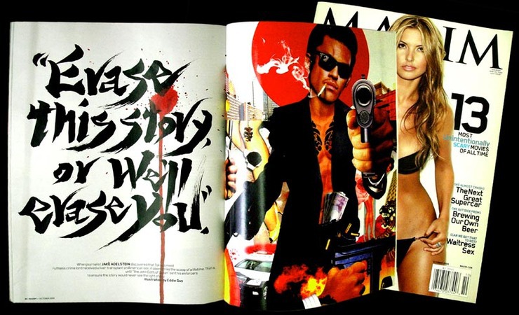 My First Blackmail.
October 14
Yes, I wrote my very first blackmail. No. Of course not for real! I’m not that kind of a girl.
Sean...
My First Blackmail.
October 14
Yes, I wrote my very first blackmail. No. Of course not for real! I’m not that kind of a girl.
Sean...
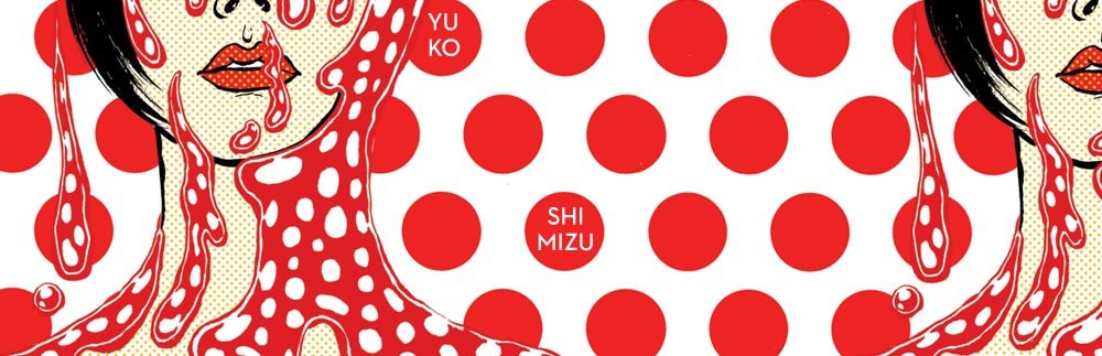
© 2024 Yuko Shimizu