Does this print well?
JUNE 23, 2010
Sometimes, what I thought was a nice piece does not print so well. Or, what I felt was so so looks great in print. It is a constant learning lesson as a commercial artist to figure out what works in print and what doesn't. Of course, how well an illustration looks also has a lot to do with how well the whole 'package' is designed.
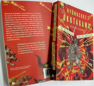
I just got samples of a new book in mail. I talked about this book multiple times in past, so, I am sorry if you are sick of it. Japanese classic: Ryunosuke Akutagawa's The Beautiful and The Grotesque. A great title, a fantastic book, published by WW Norton. Fabulous design by Rodrigo Corral (BIG fan!) and my sweet AD was Albert Tang.
This project actually didn't have an easy path. It started two summers ago, when Rodrigo contacted me to work together (hell yah I'm a fan). Then, it was on hold when economy went south all of a sudden. Last summer, the project revived with six interior illustrations. And another long one year has passed, and now I am holding the physical book! Happiness is even more.
I put a lot of time, a lot of effort, and a lot of love into this project, and with the great work by Rodrigo and Albert, it looks awesome (At least I think so). I am really really proud, and wanted to share this with you. (Although, I know, you have seen it many times before. But at least you have not seen the interior illustrations though. )
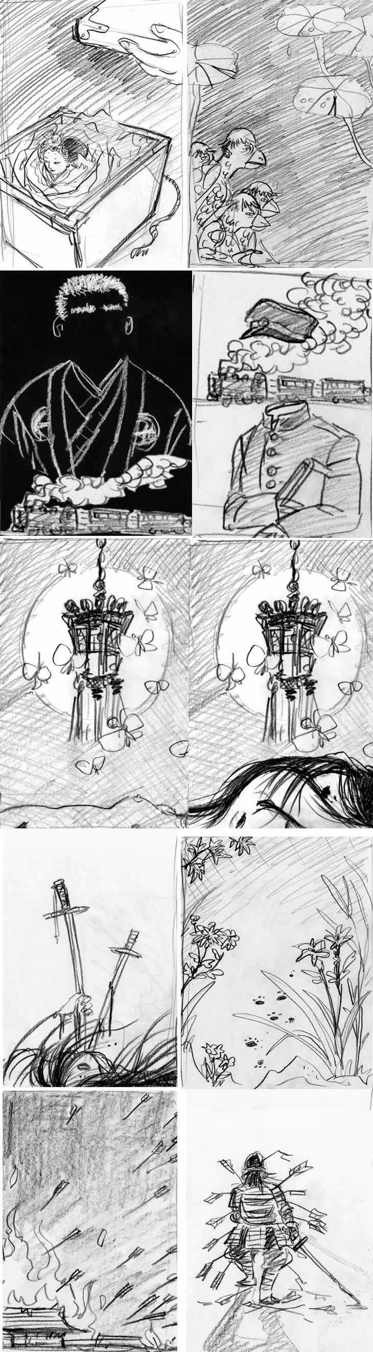
sketches for interior illustrations. Deadline was short, and Albert was "do whatever you want!". (yay.) I think I finished one or two final illustrations a day to meet the deadline. It was just a blast for me though.
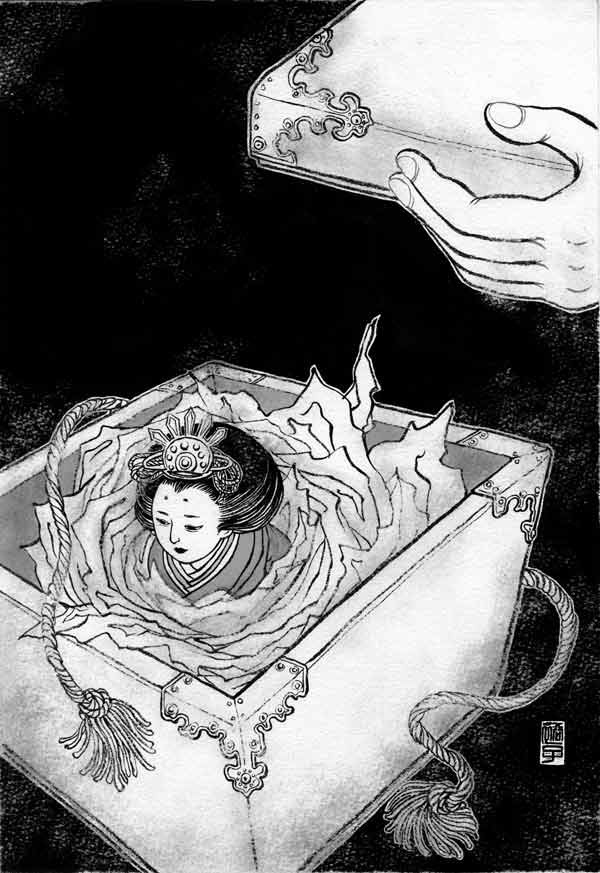
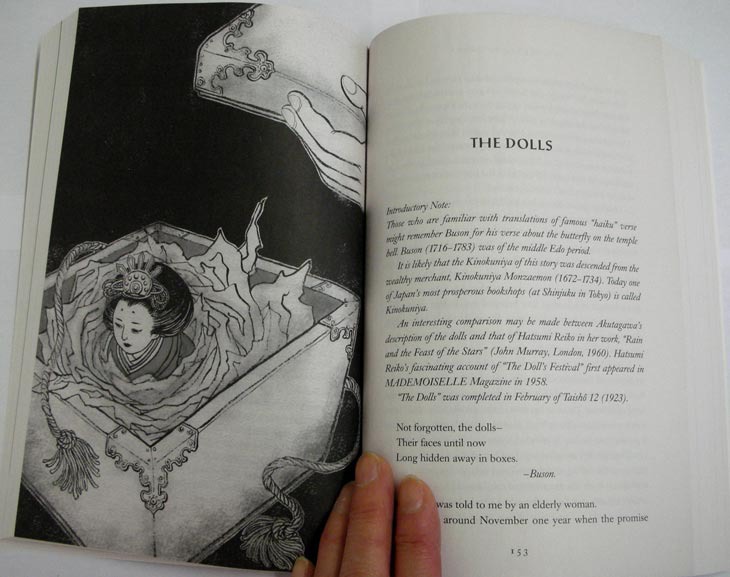
This was a story about Hina Dolls for Girls Day (March 3). In Japanese tradition, you take out the dolls only once a year for the holiday. This looks like the doll I grew up with. My mother still have them.
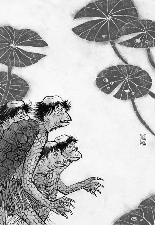
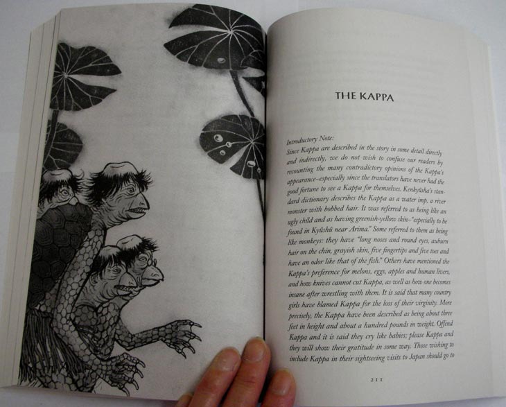
Kappa is a mythical creature believed to live by the streams.
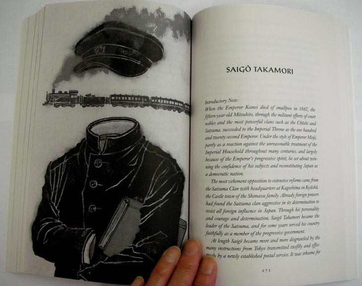
Saigo Takamori is a famous Japanese historic figure everyone is familiar with (in Japan, that is...)
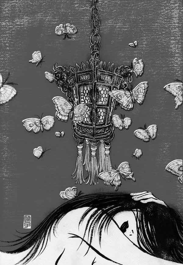
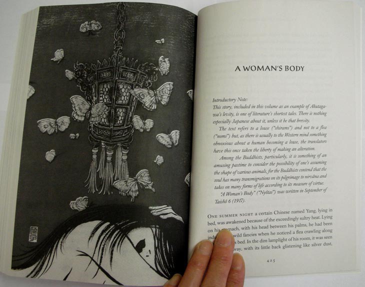
Woman's Body is the only story in this book that takes place in China. Very short but very powerful tale.
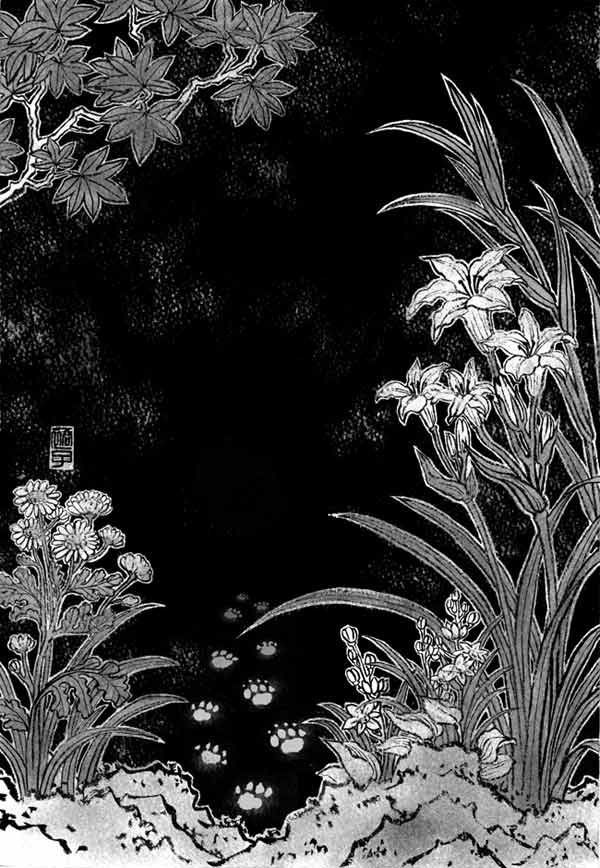
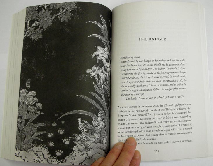
Japanese badger looks more like a raccoon. It was believed they perform magic and trick people.
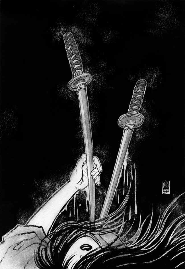
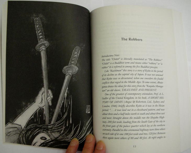
for the main and the longest story The Robbers, the interior illustration was a revival of one of the killed cover ideas. It was nice to be able to finish this idea.

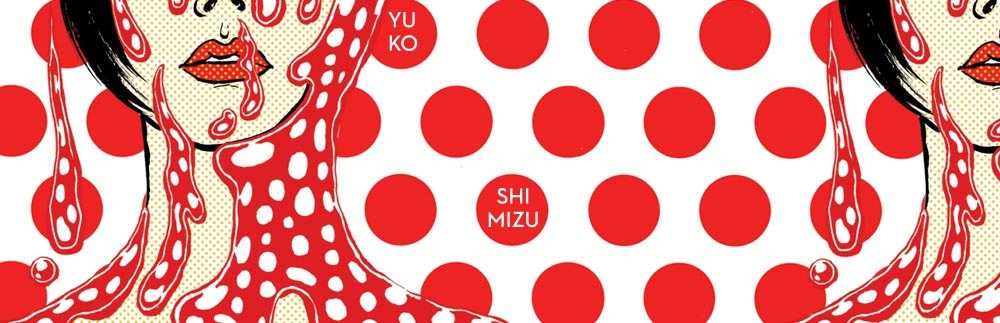
wrap around cover in actual 'package'. 満足。(very satisfied.)
Topical: illustration process
© 2024 Yuko Shimizu