Gallery Work
 Exploring Bits
March 17
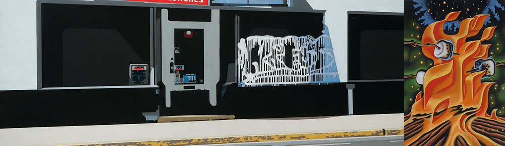
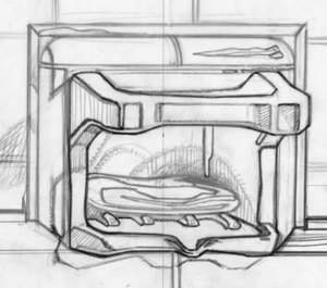
As a kid, I did build a few model kits. It was there that I first fell in love with the box art and the diagrams that...
Exploring Bits
March 17
As a kid, I did build a few model kits. It was there that I first fell in love with the box art and the diagrams that...
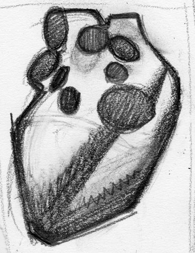
 Bull Pin
April 8
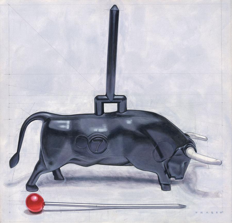
Bull Pin;The two tiny items hung around my desktop for the last couple of years. As I looked at them from time to time...
Bull Pin
April 8
Bull Pin;The two tiny items hung around my desktop for the last couple of years. As I looked at them from time to time...
 Digging with a Puck
September 28
Digging with a Puck
September 28
 Domestic
April 12
Recent observations with a little carpentry. I still have all my fingers.
Domestic
April 12
Recent observations with a little carpentry. I still have all my fingers.
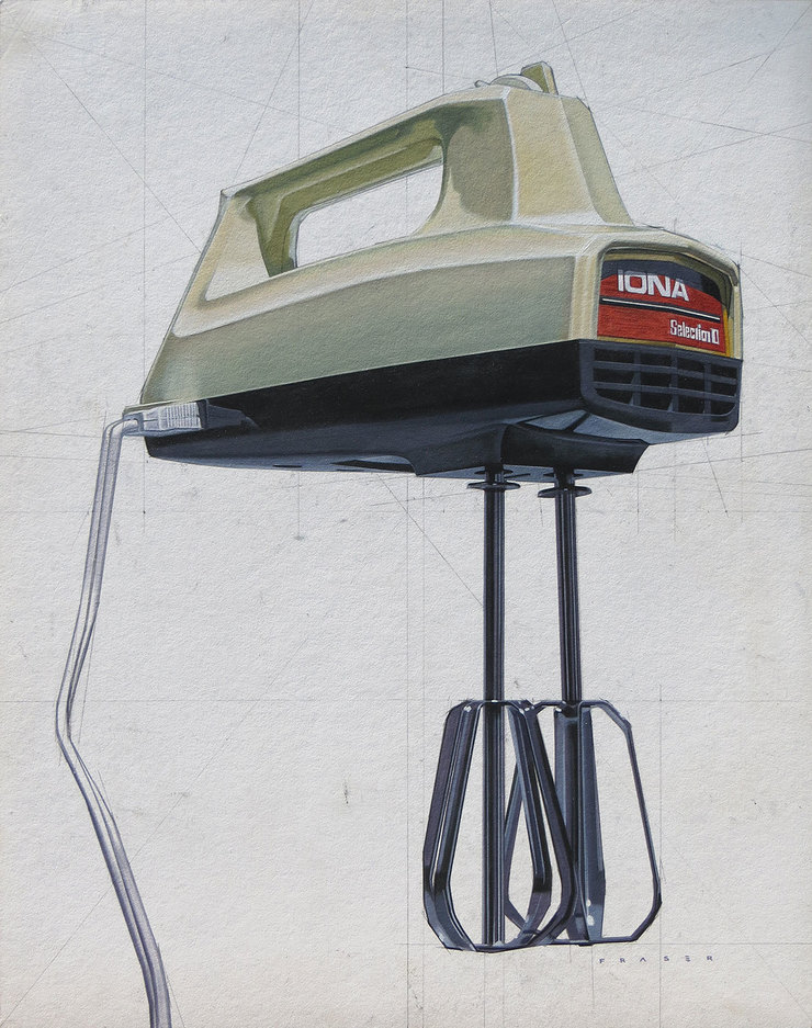 Summer Mixer
August 1
Summer Mixer
August 1
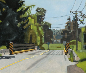
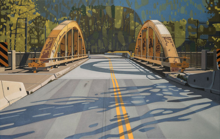
 Bridges
May 30
I returned to the subject of a bridge recently. It was again on highway #3, the Crowsnest Pass through southern...
Bridges
May 30
I returned to the subject of a bridge recently. It was again on highway #3, the Crowsnest Pass through southern...
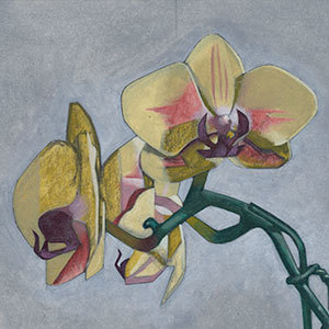 Flower & Tiger
February 2
It’s winter and my activities are more inside. The sun’s low in the sky, and the days are short. A...
Flower & Tiger
February 2
It’s winter and my activities are more inside. The sun’s low in the sky, and the days are short. A...
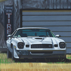 Camaro & Dirt Bike
November 29
I think it was the combination of the flat bone white bleached paint with dry grass, plywood clad garage, the tar...
Camaro & Dirt Bike
November 29
I think it was the combination of the flat bone white bleached paint with dry grass, plywood clad garage, the tar...
 Small Big
February 7
I've been exploring my own framing the last few years. I see some very interesting history on the backside of...
Small Big
February 7
I've been exploring my own framing the last few years. I see some very interesting history on the backside of...
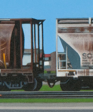
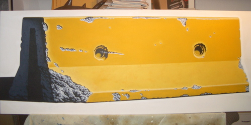
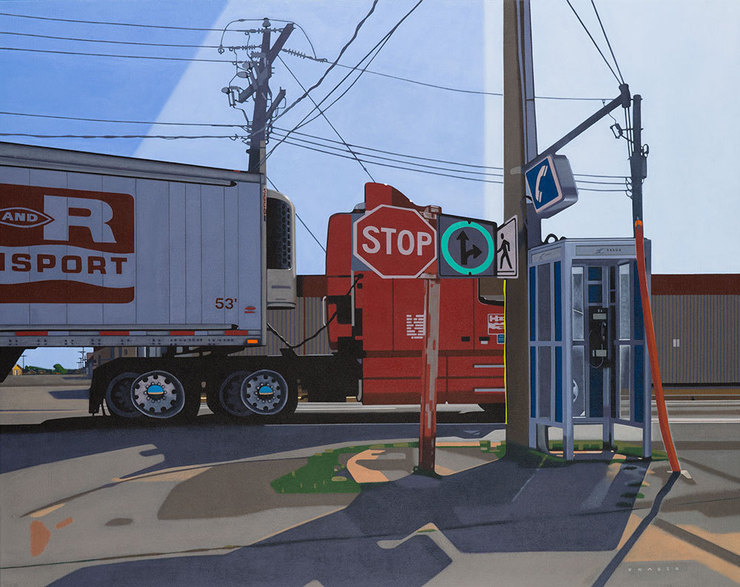 53ft
December 16
Driving through southern Alberta last June, I stopped to use a public washroom. Another road that I’ve been...
53ft
December 16
Driving through southern Alberta last June, I stopped to use a public washroom. Another road that I’ve been...
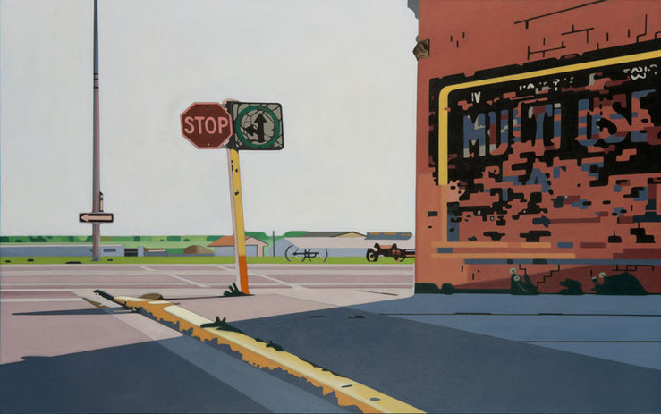
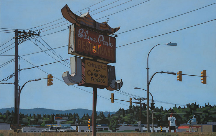 Leftover
August 7
Another roadside artifact that I've driven by many times. The sign and others like it brought back many memories of...
Leftover
August 7
Another roadside artifact that I've driven by many times. The sign and others like it brought back many memories of...
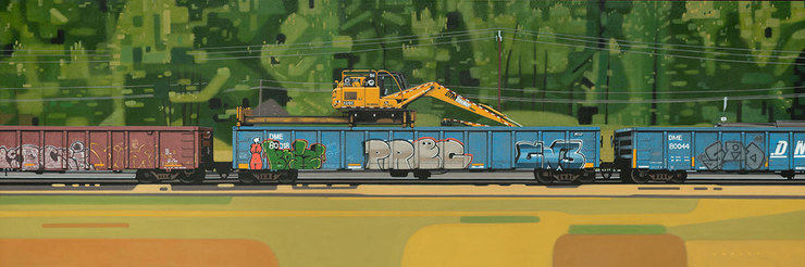 Ties & Trees
May 4
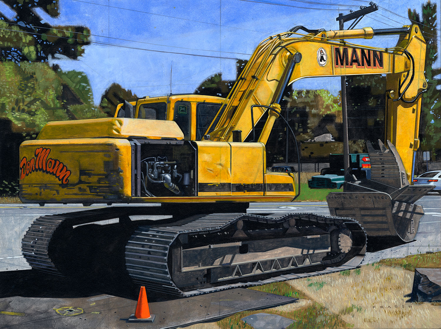
While driving through the southern interior of British Columbia last summer I noticed an unusual type of machinery...
Ties & Trees
May 4
While driving through the southern interior of British Columbia last summer I noticed an unusual type of machinery...
 Meander
November 19
Almost getting run over, or just having some passer-by looking at me gawking on. Then fumbling out my tiny cheap...
Meander
November 19
Almost getting run over, or just having some passer-by looking at me gawking on. Then fumbling out my tiny cheap...
 Totems
June 16
I've been by this Totem many times. In the summer people are stopped and photographing it, or having a roadside...
Totems
June 16
I've been by this Totem many times. In the summer people are stopped and photographing it, or having a roadside...
 4 Paint & 1 Vector
May 8
4 Paint & 1 Vector
May 8
 Back Road
November 26
I'm enjoying getting out of my studio these days. A painting from running around old back roads here on the west...
Back Road
November 26
I'm enjoying getting out of my studio these days. A painting from running around old back roads here on the west...
 March
February 15
I've been working on a few more pieces for exhibition. Looking to have them up for the first of March at my...
March
February 15
I've been working on a few more pieces for exhibition. Looking to have them up for the first of March at my...
 Walls & Stairs
October 18
After scraping and heat gunning the old paint from some of our old house last summer, and then prepping, and...
Walls & Stairs
October 18
After scraping and heat gunning the old paint from some of our old house last summer, and then prepping, and...
 Shape & Size
March 5
In one of my recent paintings I wanted to capture a feeling of visual perspective, and explore the shape of...
Shape & Size
March 5
In one of my recent paintings I wanted to capture a feeling of visual perspective, and explore the shape of...
 Drawing Time
February 6
Drawing Time
February 6
 Rail
January 2
My painting Rail along with another of my recent pieces, will be in a group show opening on January. In this piece,...
Rail
January 2
My painting Rail along with another of my recent pieces, will be in a group show opening on January. In this piece,...
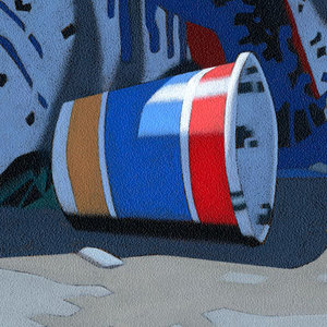 Trash
December 12
Last July, while out running errands on my motorcycle, I pulled over to take a break. I stopped near a venue with a...
Trash
December 12
Last July, while out running errands on my motorcycle, I pulled over to take a break. I stopped near a venue with a...
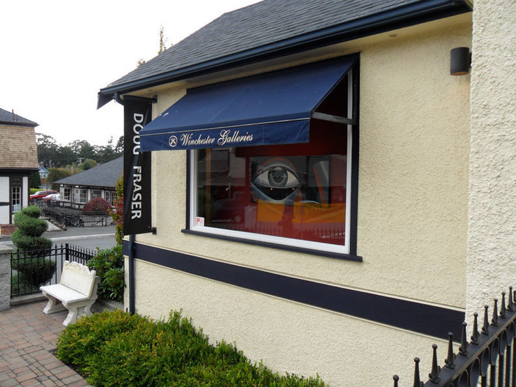 After Print
October 3
Well I have my first full show at the Winchester Gallery here on the west coast. A few singular pieces have been...
After Print
October 3
Well I have my first full show at the Winchester Gallery here on the west coast. A few singular pieces have been...
 Straight to Paint
June 23
The last while I would develop a digital rough when developing a painting. I've skipped that stage in my recent...
Straight to Paint
June 23
The last while I would develop a digital rough when developing a painting. I've skipped that stage in my recent...
 An Anchor Point
January 9
As an illustrator, I've worked for a while now with digital software. The adobe illustrator software has been my...
An Anchor Point
January 9
As an illustrator, I've worked for a while now with digital software. The adobe illustrator software has been my...
 Roxy
August 9
Finished another personal piece. The painting is of an old local movie theatre from the back. The name of the...
Roxy
August 9
Finished another personal piece. The painting is of an old local movie theatre from the back. The name of the...
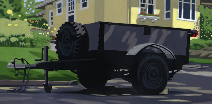 Utility
May 24
My neighbour across the street has an old homebuilt utility trailer. It's used to carry old furniture, soil,...
Utility
May 24
My neighbour across the street has an old homebuilt utility trailer. It's used to carry old furniture, soil,...
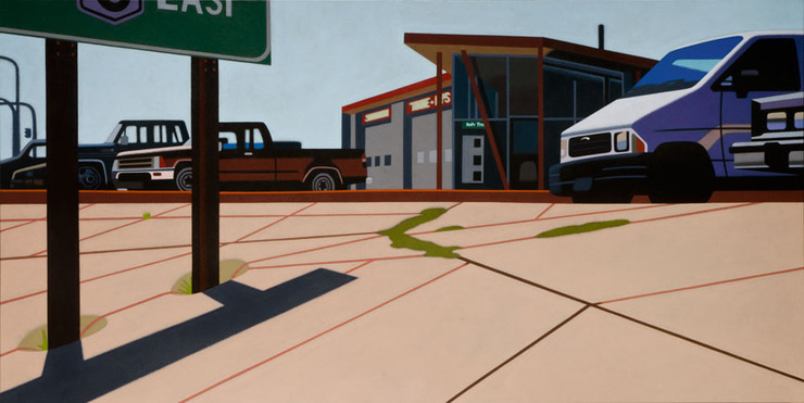 3 East
April 26
3 East is the name of my latest gallery painting. In my gallery work, I've been trying to deconstruct the...
3 East
April 26
3 East is the name of my latest gallery painting. In my gallery work, I've been trying to deconstruct the...
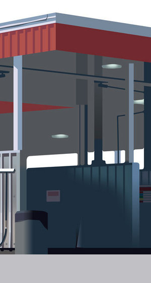
 Golden Pump
February 24
Had a holiday break for a spell in late January. After that in February I've been working on several charity...
Golden Pump
February 24
Had a holiday break for a spell in late January. After that in February I've been working on several charity...
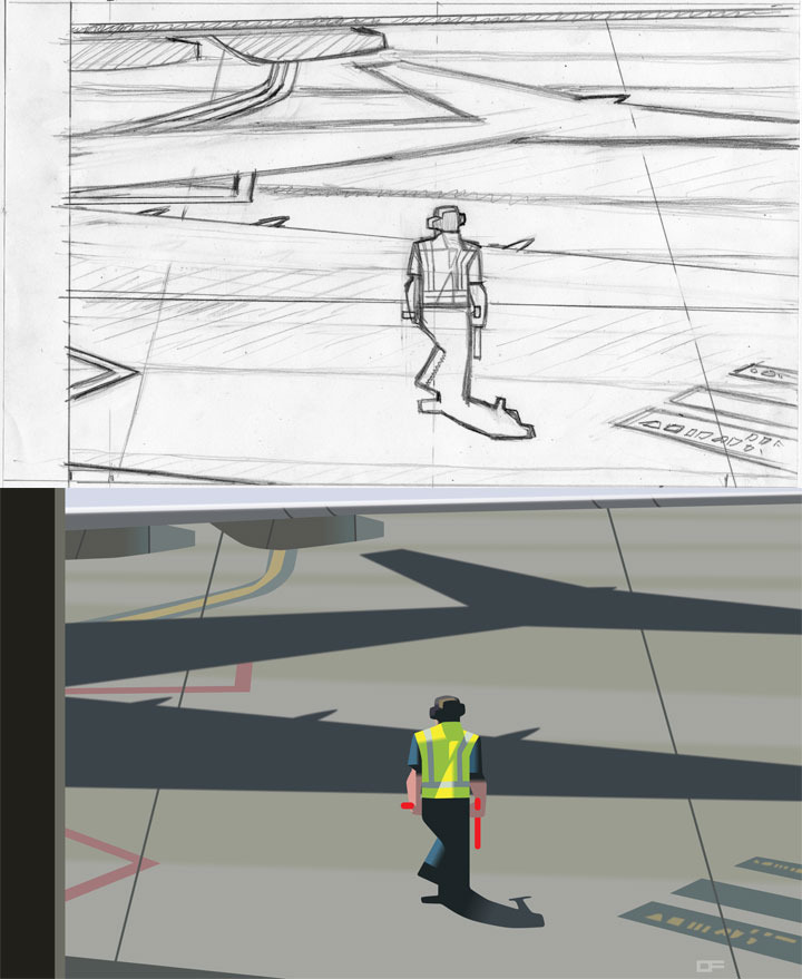 Gate D43
November 2
I've finished another canvas. The subject was a photo I shot out the window of an airport while waiting for our...
Gate D43
November 2
I've finished another canvas. The subject was a photo I shot out the window of an airport while waiting for our...
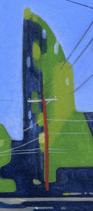
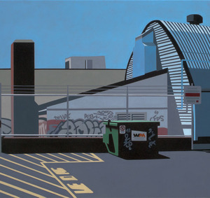
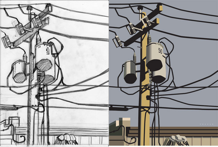 Pole Dancing
September 15
I finished this painting about a month ago. I was out and about in an industrial part of my home city. The...
Pole Dancing
September 15
I finished this painting about a month ago. I was out and about in an industrial part of my home city. The...
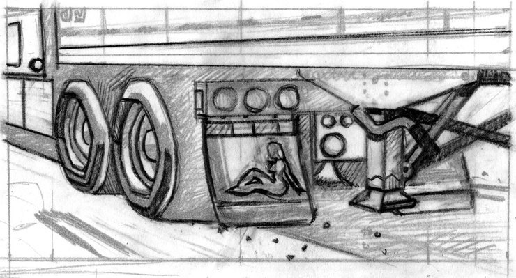 Chrome Lady
June 4
Recently finished gallery work. Oils on wooden panel, 24" by 12". I'm looking toward a subtle level of...
Chrome Lady
June 4
Recently finished gallery work. Oils on wooden panel, 24" by 12". I'm looking toward a subtle level of...
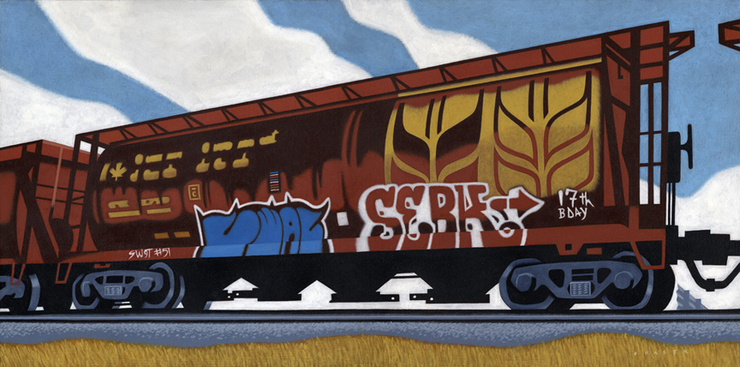 Tagged Grain
April 8
Still working on my illustration assignments, but stayin' up a little later to do some of my own stuff. I...
Tagged Grain
April 8
Still working on my illustration assignments, but stayin' up a little later to do some of my own stuff. I...
 Back of My Studio
January 2
Outside of my illustration assignments I've been doing some personal directed painting. I feel as though I'm working...
Back of My Studio
January 2
Outside of my illustration assignments I've been doing some personal directed painting. I feel as though I'm working...
© 2024 Douglas Fraser