Bill Mayer
Cloud Nine/Steppenwolf Theatre
JUNE 2, 2016
The first poster was so much fun we asked if we could do another one. The art diector said they would love that . Maybe we could do another style for the secound poster, I had not done a poster using the stamp illustrations and that see,ed like a perfect fit. As always though starting with thumbnail ideas.
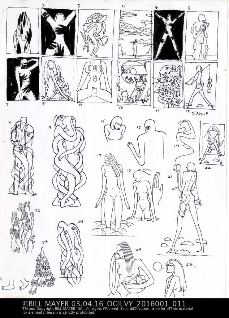
Okay yes way too many ideas, but that is always such a great part of working on any illustration... So many directions you can go visually. Finding the perfect one tha tworks for me and the art director is always a puzzel.
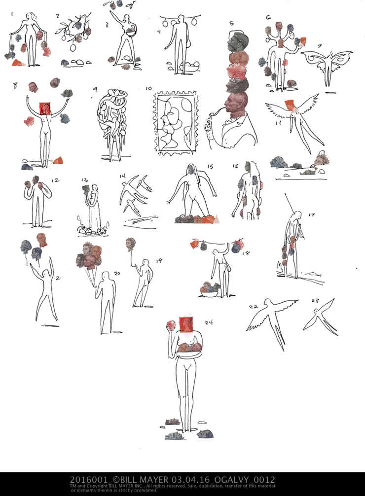
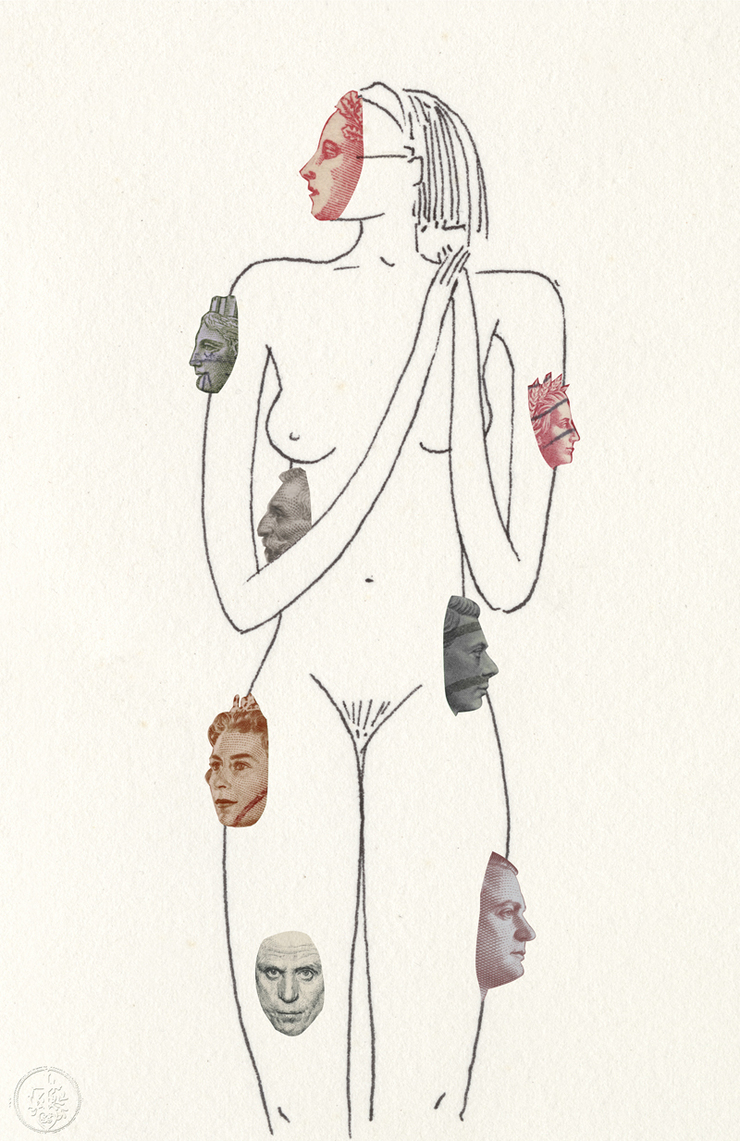
I had a few thing s i needed to get out of my head. Cloud Nine is a rather randy play which sounded like in the synopsis that everyone was sleeping with everyone. So something nice a sexy seemed appropriate. I really liked some of the other directions that I came up with but I will save them in the back of my head for some other projject. Thumbnailing for me is kind of a visual stream of contiousness, I sort of get lost a little during the process but it always generates a few worthy candidates to take to final.
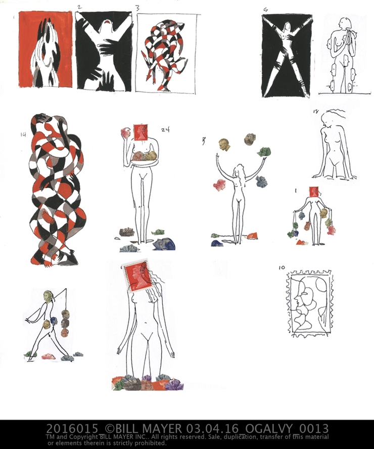
The color scheme is still red black and values of those colors. in the final i pulled all of the colors toward that and I did miss some of the subblty of the missing colors. Overall though I felt they did impact the final poster. Much thanks to the folks at Stepanwolf Theater and Ogalvy for a chance to do a really fun project.

© 2024 Bill Mayer