 Napoleon for Smithsonian
June 5
I was commissioned by Smithsonian Magazine to paint a portrait of Napoleon Bonaparte for the current issue. ...
Napoleon for Smithsonian
June 5
I was commissioned by Smithsonian Magazine to paint a portrait of Napoleon Bonaparte for the current issue. ...
 If Animals were like Humans
May 7
Recently I was talking to my soon-to-be former students about sketchbooks. They are so very important and what comes...
If Animals were like Humans
May 7
Recently I was talking to my soon-to-be former students about sketchbooks. They are so very important and what comes...
 Michael Brown for Esquire
January 13
This summer I was troubled, as were many other Americans, when an unarmed black man, Michael Brown was killed in...
Michael Brown for Esquire
January 13
This summer I was troubled, as were many other Americans, when an unarmed black man, Michael Brown was killed in...
 Je Suis Charlie
January 9
Je Suis Charlie
January 9
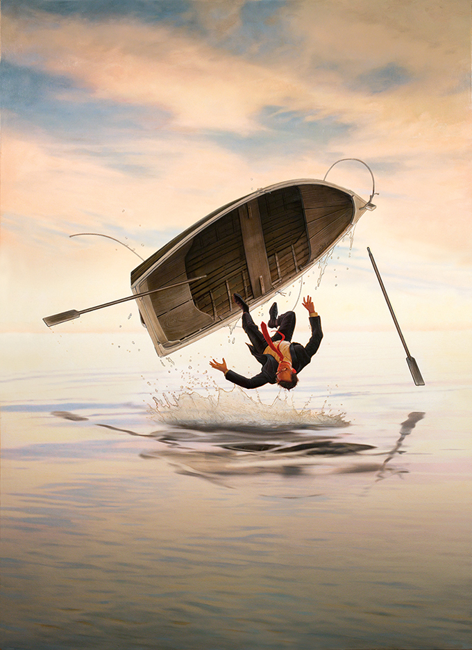 The Boat
December 19
Life couldn't have worked out better by the end of 2014. Still, the Irish in me begins to feel wary when...
The Boat
December 19
Life couldn't have worked out better by the end of 2014. Still, the Irish in me begins to feel wary when...
 Duck/Rabbit Illusion for Nautilus
November 6
Every now and then an assignment comes along that is just perfect with where your head is. A freelancer should...
Duck/Rabbit Illusion for Nautilus
November 6
Every now and then an assignment comes along that is just perfect with where your head is. A freelancer should...
 Arcadia Contemporary Soho
October 9
As a moderately busy illustrator with a series of deadlines linked together with more deadlines, I can sometimes...
Arcadia Contemporary Soho
October 9
As a moderately busy illustrator with a series of deadlines linked together with more deadlines, I can sometimes...
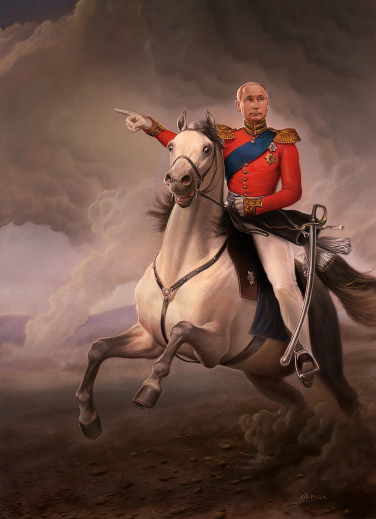 Putin for the Wall Street Journal
June 1
Our world seems to have an open assignment that some leader seeks to take in every era. Who would seek to be...
Putin for the Wall Street Journal
June 1
Our world seems to have an open assignment that some leader seeks to take in every era. Who would seek to be...
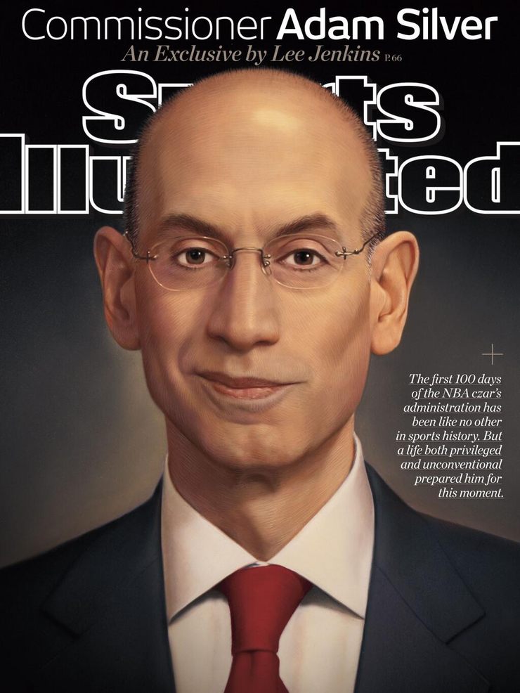 Adam Silver for Sports Illustrated
May 22
Last week I was called by Sports Illustrated to paint the new NBA commissioner and suddenly famous Adam Silver, the...
Adam Silver for Sports Illustrated
May 22
Last week I was called by Sports Illustrated to paint the new NBA commissioner and suddenly famous Adam Silver, the...
 The God Project for Stanford Magazine
May 6
The God Project
Recently for Stanford Magazine, I was asked to illustrate an article about the idea...
The God Project for Stanford Magazine
May 6
The God Project
Recently for Stanford Magazine, I was asked to illustrate an article about the idea...
© 2024 Tim O'Brien