
 Whether you make it or not is never about talent. message to the aspiring artists
January 14
“Can you tell who’s going to make it in your class?” I sometimes get this big question. And...
Whether you make it or not is never about talent. message to the aspiring artists
January 14
“Can you tell who’s going to make it in your class?” I sometimes get this big question. And...
 art doesn't save people's lives (but it can do other things instead)
July 10
This is a portrait of a young man I created back in 2006 for a Christian magazine. This young man, who loved...
art doesn't save people's lives (but it can do other things instead)
July 10
This is a portrait of a young man I created back in 2006 for a Christian magazine. This young man, who loved...
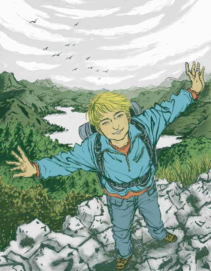
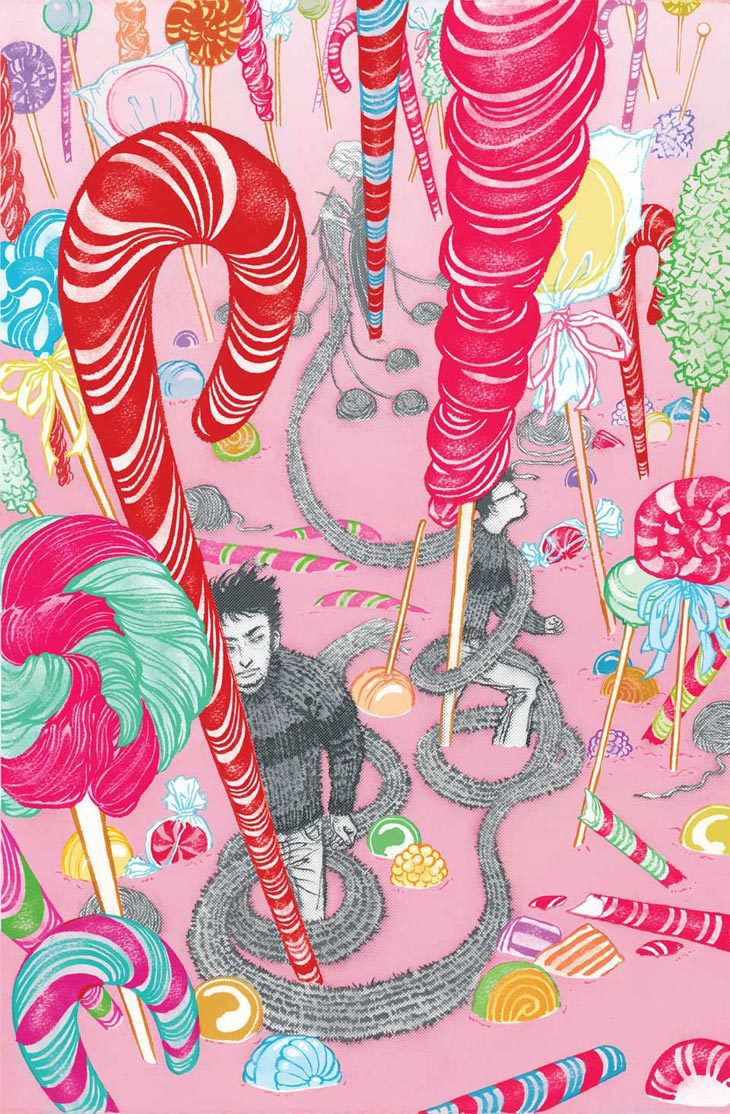 Merry Christmas, Happy Holidays.
December 23
Many of you may be off from school or work, and heading home to see your family.
Every year, I pick an image I...
Merry Christmas, Happy Holidays.
December 23
Many of you may be off from school or work, and heading home to see your family.
Every year, I pick an image I...
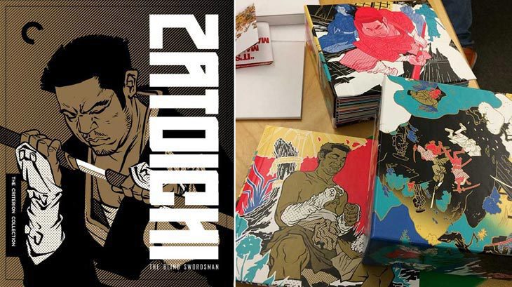 26 illustrators for Zatoichi box set
December 16
Known for their beautiful collector DVD/Blu-Ray packagings, Criterion Collection has done it again. And...
26 illustrators for Zatoichi box set
December 16
Known for their beautiful collector DVD/Blu-Ray packagings, Criterion Collection has done it again. And...
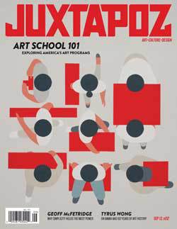 life after art school, now what? conversation on JUXTAPOZ
August 27
The latest issue of JUXTAPOZ Magazine(September 2013) has a big feature called Art School 101, where...
life after art school, now what? conversation on JUXTAPOZ
August 27
The latest issue of JUXTAPOZ Magazine(September 2013) has a big feature called Art School 101, where...
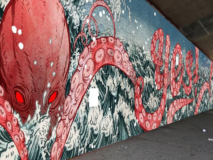 attack of the 80 foot octopus (mural)
August 14
I just came back from DUMBO, Brooklyn, where two identical, yet completely different 80 foot long murals (about 24...
attack of the 80 foot octopus (mural)
August 14
I just came back from DUMBO, Brooklyn, where two identical, yet completely different 80 foot long murals (about 24...
 Why I think day job is good for you. (for aspiring artists out there)
July 9
I was buying a box of cereal. I said "hi" to the girl at the checkout counter, but she didn't even...
Why I think day job is good for you. (for aspiring artists out there)
July 9
I was buying a box of cereal. I said "hi" to the girl at the checkout counter, but she didn't even...
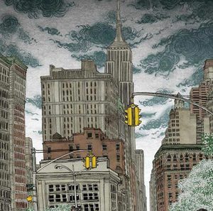 location drawing (virtually) on Google Map
July 1
I use Google Maps all the time. You do too, right? I just used it yesterday to find out where exactly was the West...
location drawing (virtually) on Google Map
July 1
I use Google Maps all the time. You do too, right? I just used it yesterday to find out where exactly was the West...
 15 influences, that stick with you, FOREVER.
April 10
This is a re-posting from my personal blog. I was initially not goint to post this here, but then again, thought it...
15 influences, that stick with you, FOREVER.
April 10
This is a re-posting from my personal blog. I was initially not goint to post this here, but then again, thought it...
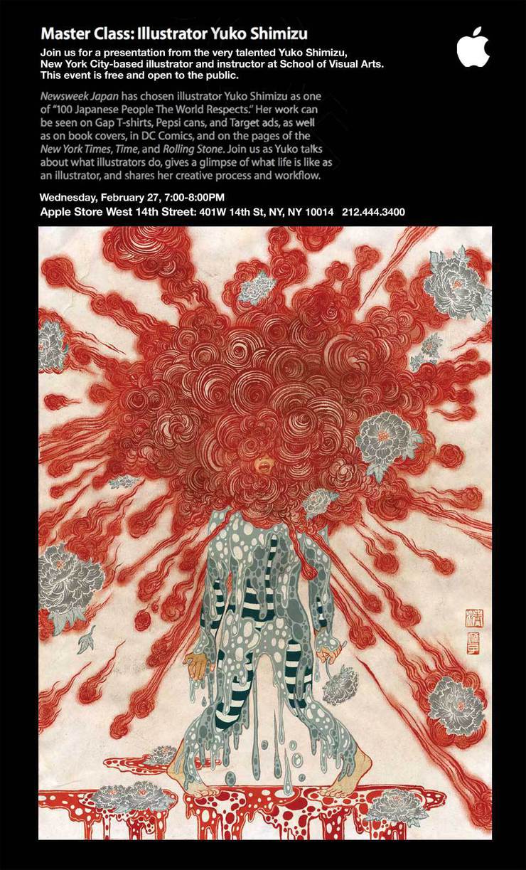 free event at Apple Store NY
February 26
This announcement is mainly for students and young illustrators.
Come hang with me at my talk...
free event at Apple Store NY
February 26
This announcement is mainly for students and young illustrators.
Come hang with me at my talk...
© 2024 Yuko Shimizu